
projects
Thousand Candles
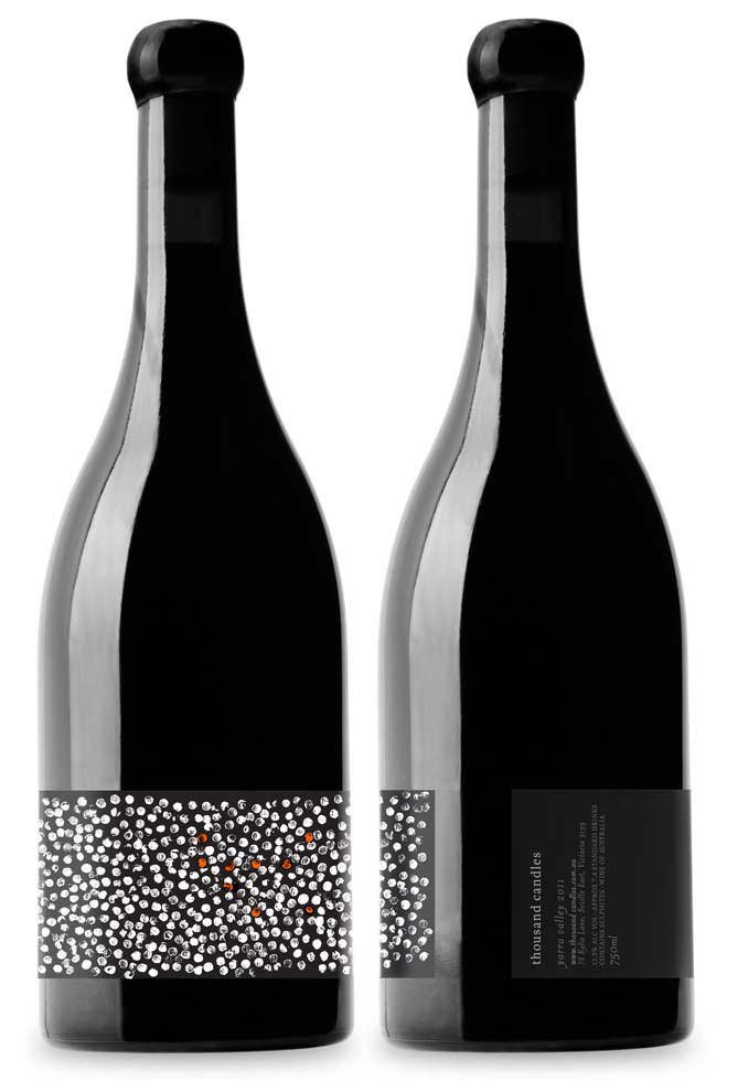
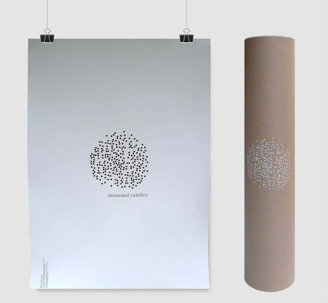
A Yarra Valley ‘farm’ that incorporates wine, food and ideas. It’s wine and philosophy is built on a respect for place and culture. Named after an ancient Aboriginal ceremony granting ‘freedom of the bush’, which concludes with the lighting of firesticks, of which one observer in the 19th century remarked: “Suddenly, it was as if the twilight was interrupted by a thousand candles”. A luxurious and simple solution answered the brief to tell this tale.
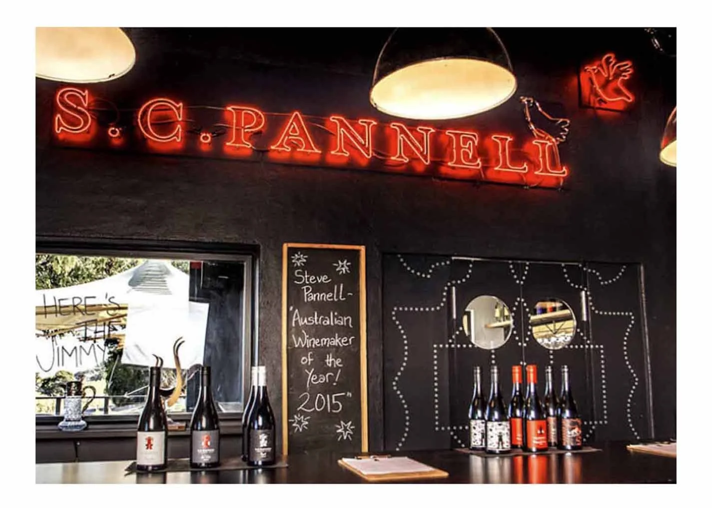
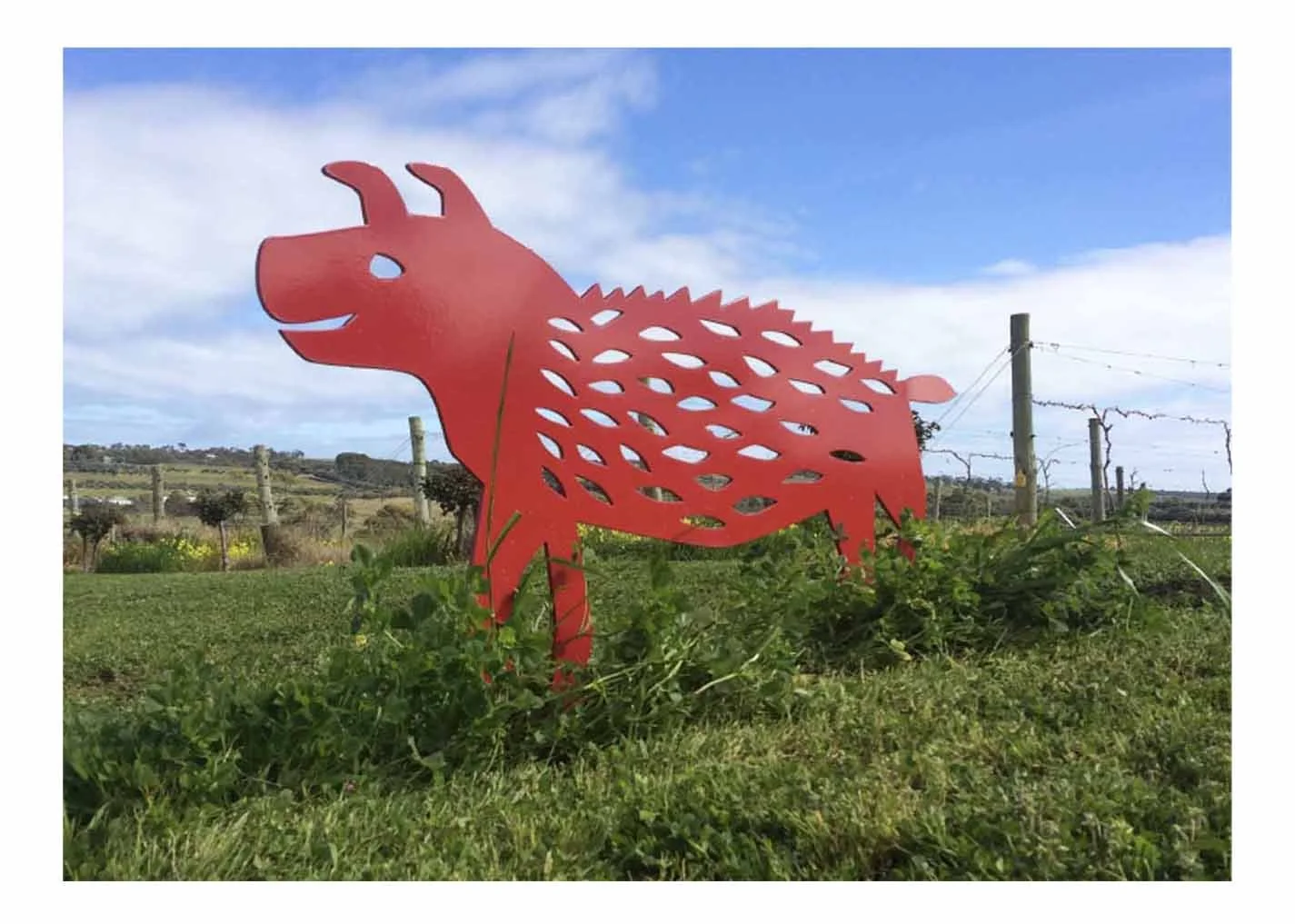
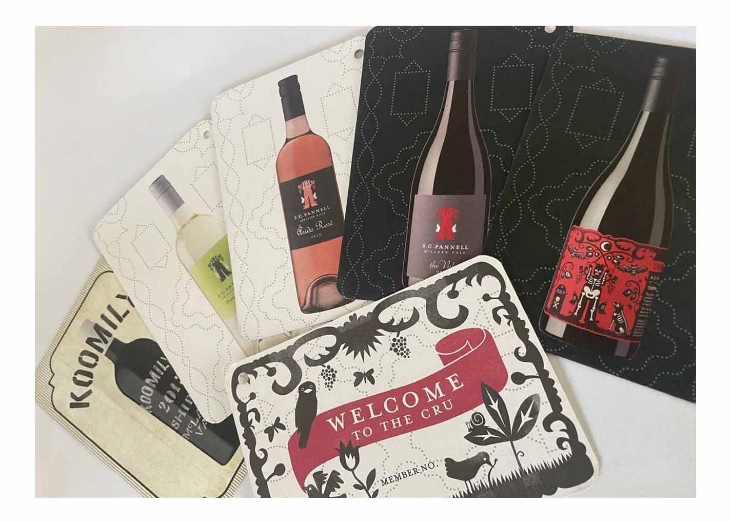
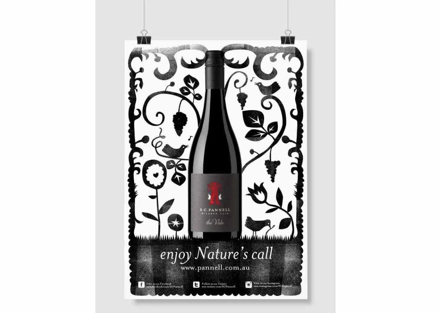
Pannell Enoteca
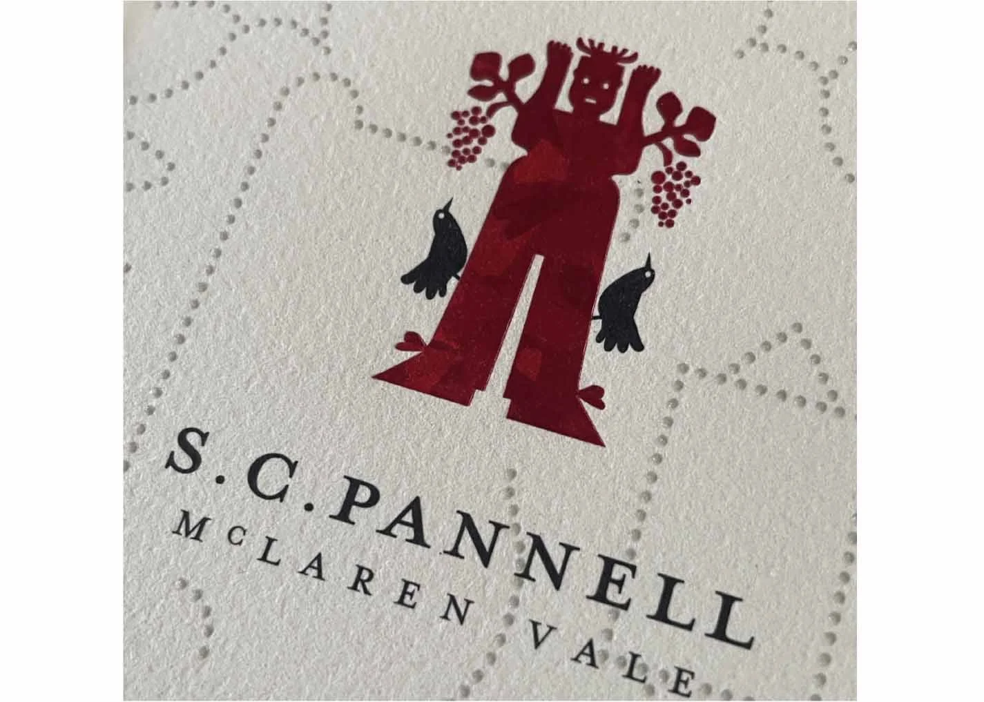
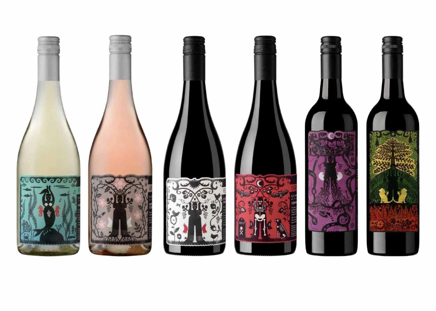
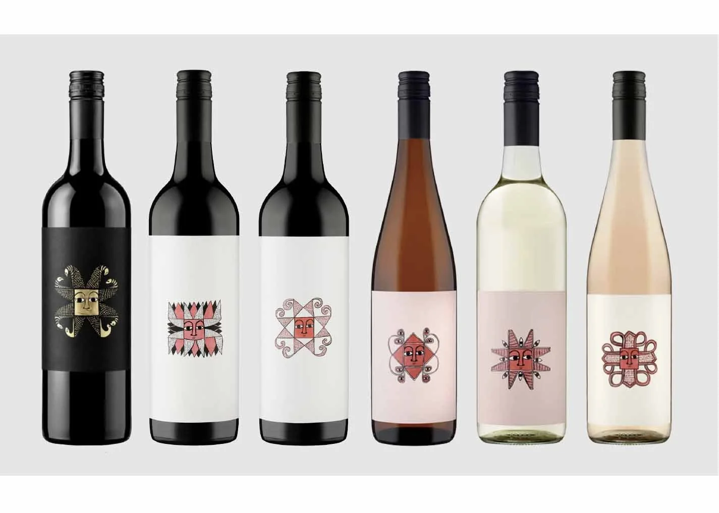
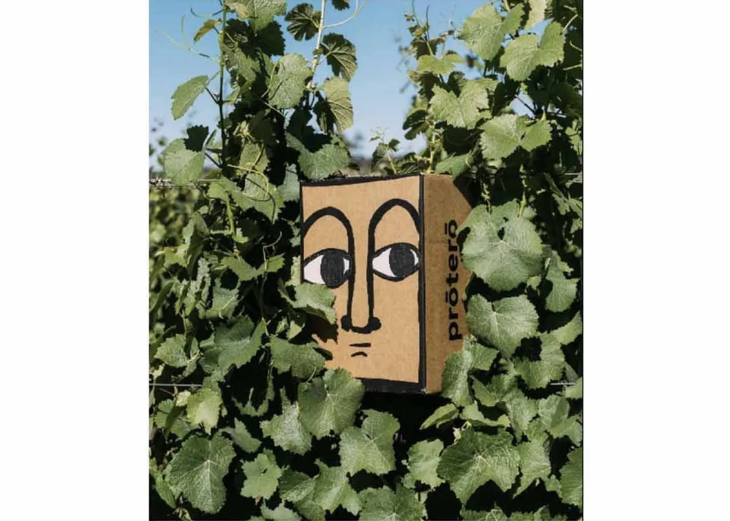
A label series with as much personality as the winemaker himself. Earthy, hands-on and full of character, the design brings Steve’s distinctive spirit to the bottle - a recognisable face for wines made with craft, instinct and love.
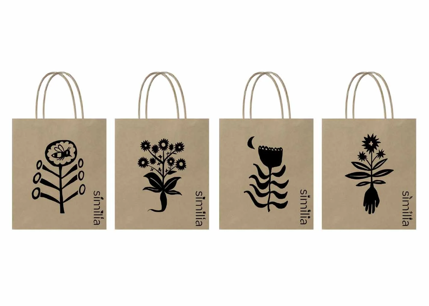
similia
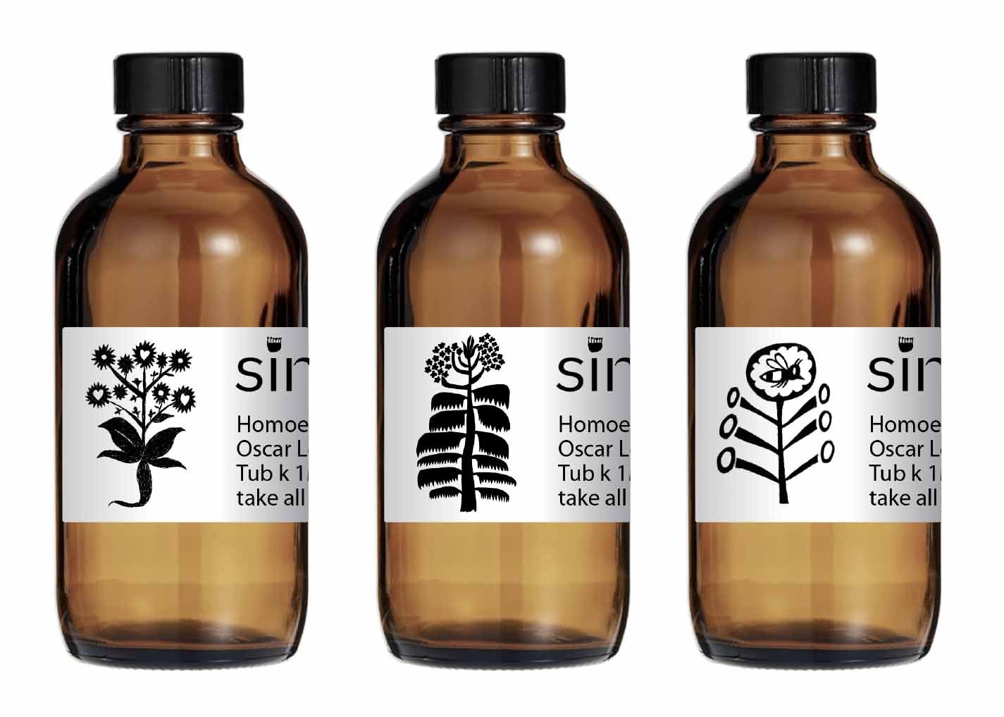
Similia is a homeopathic practice whose name reflects the idea of using a little of something to counteract a problem. With natural elements at the heart of the practice, the brand called for a fluid, organic and natural approach.
Ink illustrations became the foundation of the visual identity, with a series of delicate, hand-drawn elements creating a sense of nature, movement and connection.
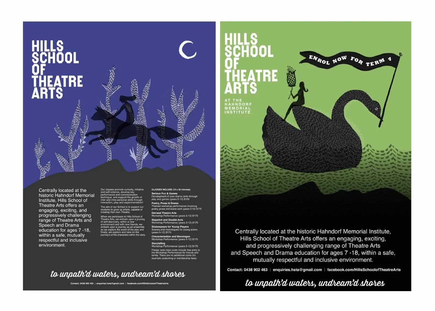
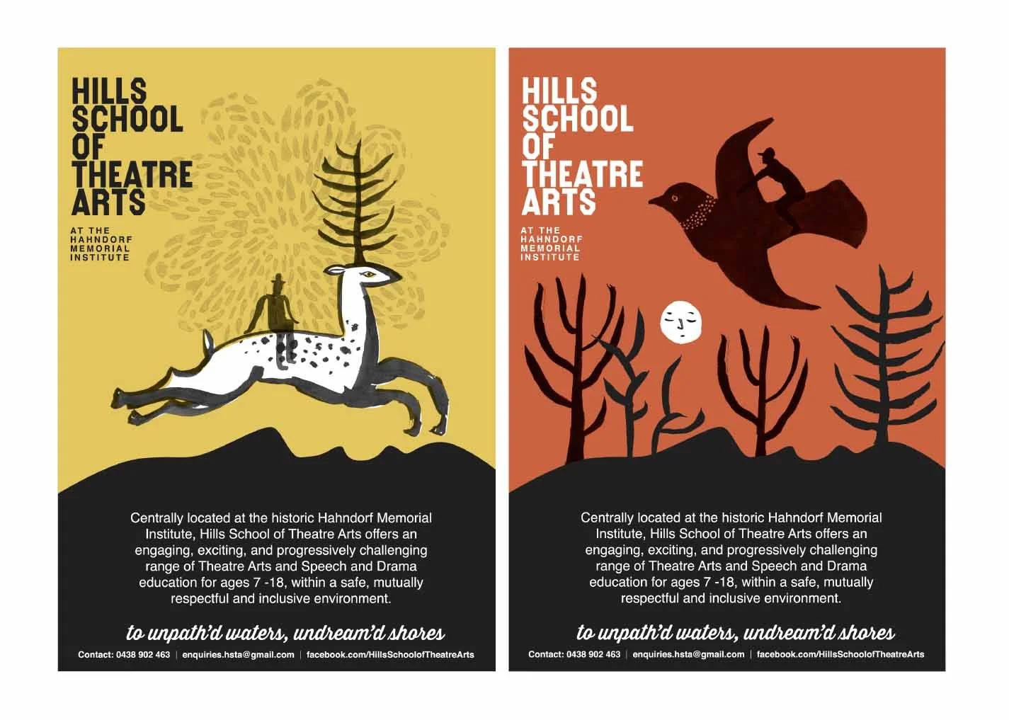
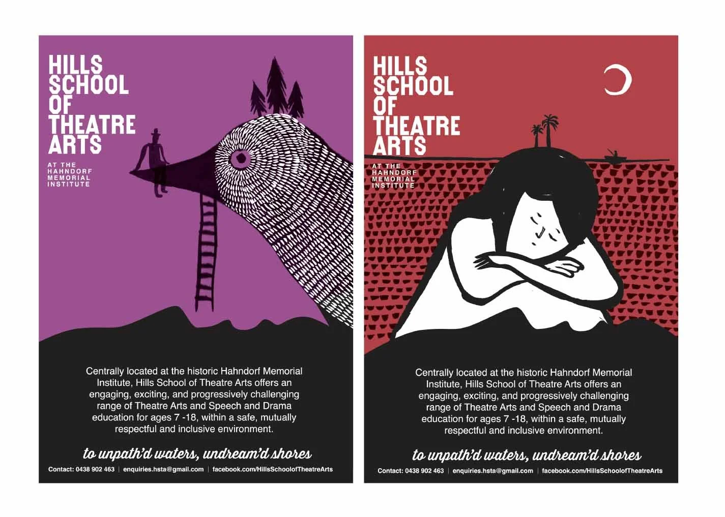
Hills School of Theatre Arts
Based in Hahndorf, Hills School of Theatre Art encourages young people to challenge themselves, discover their creativity and grow as performing artists. The brand was designed to feel as playful, curious and engaging as the classes themselves, with quirky illustrations adding a sense of mystery and inviting kids to explore what’s possible.
Hills Harvest Exchange
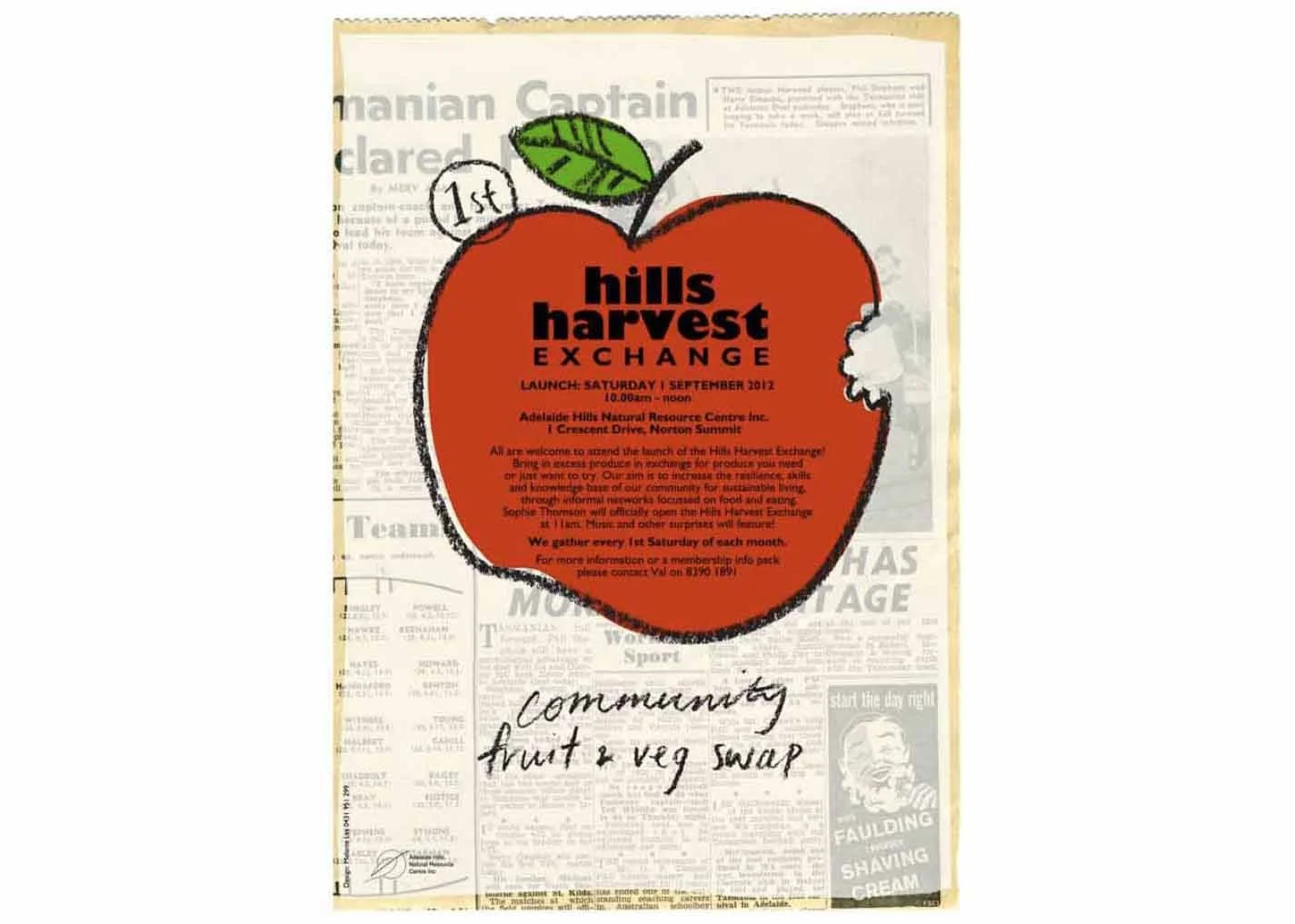
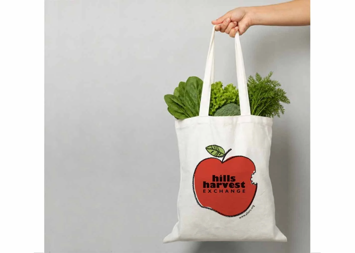
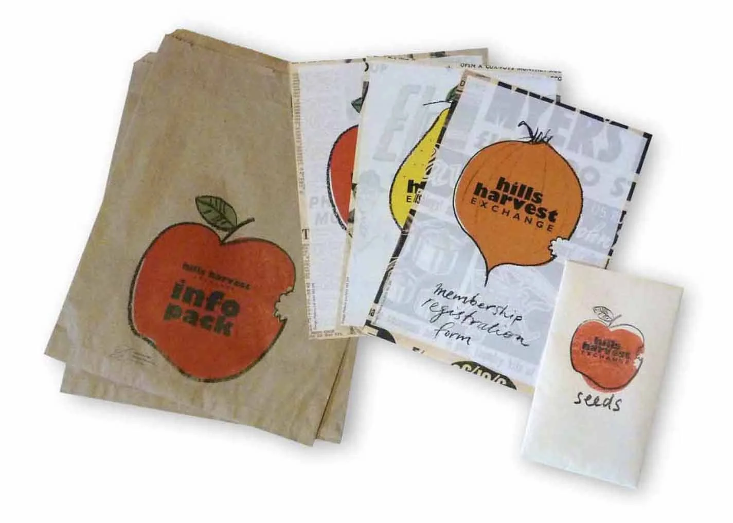
A community swap for the things we grow, make and have too much of. We wanted the identity to feel just as resourceful and hands-on as the event itself, using recycled materials and tactile techniques to bring it to life. A cast of fruits and vegetables weave in and out of the logo, giving the brand plenty of flexibility - and a healthy dose of fun.
palya
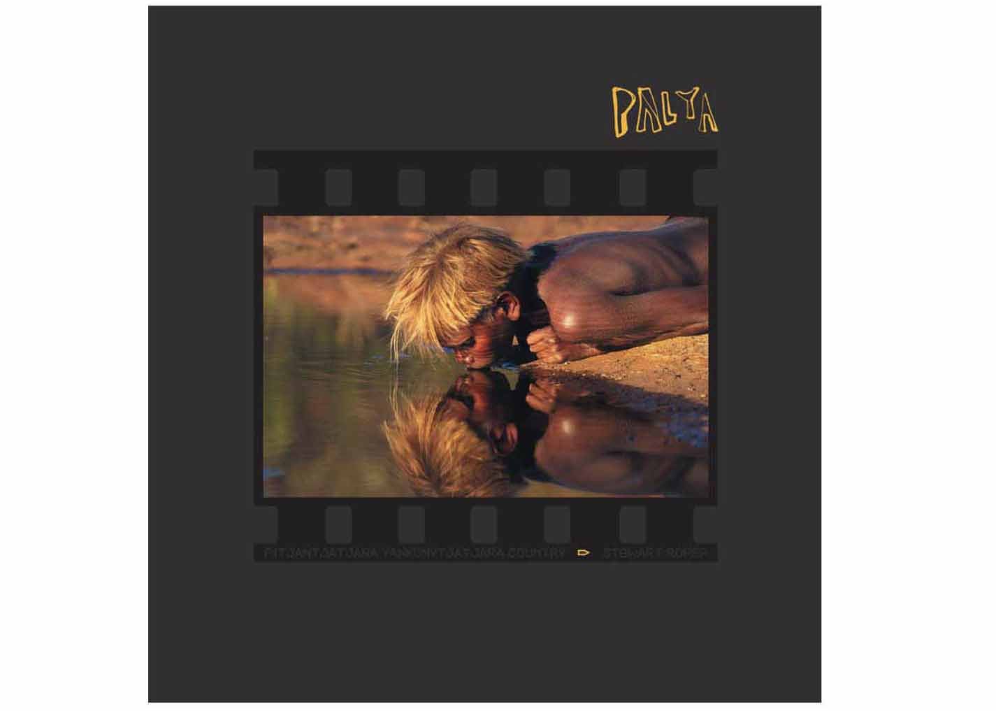
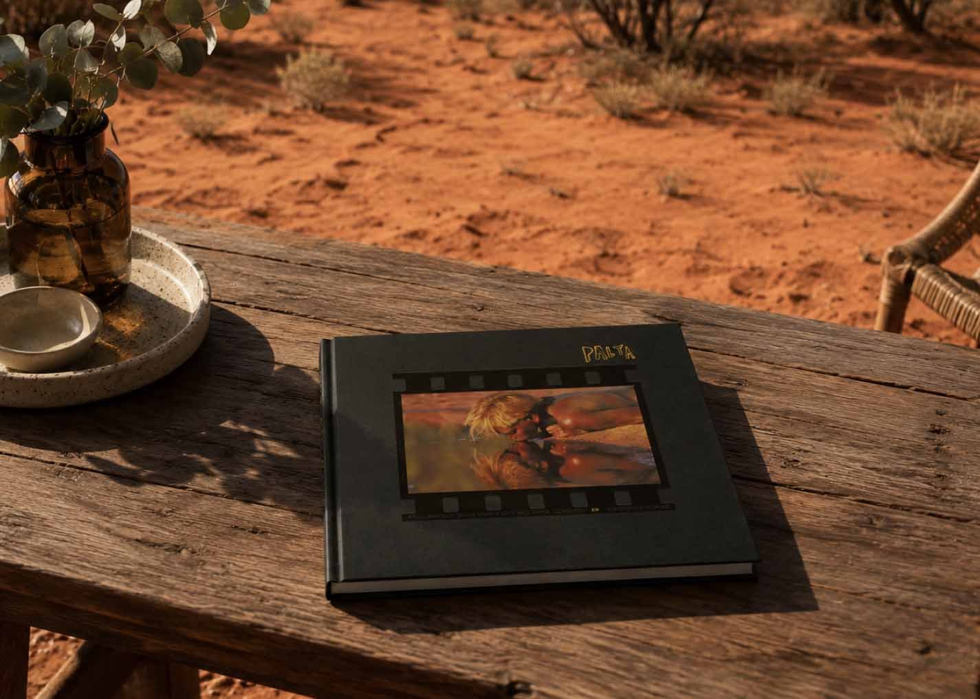
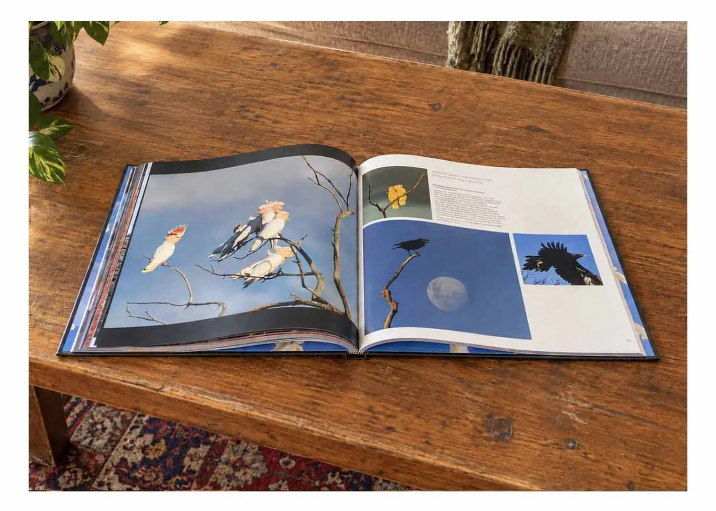
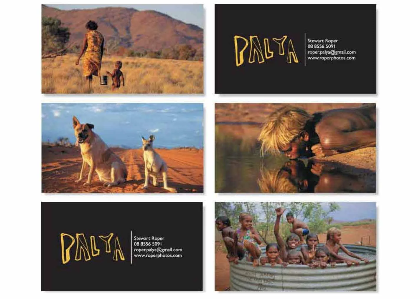
Palya brings together two decades of Stewart Roper’s photography from the Anangu Pitjantjatjara Yankunytjatjara (APY) Lands. A portrait of Country and community, the book explores the striking landscapes and the people who have shaped Stewart’s experience of this remote and remarkable part of Australia. Palya - Good
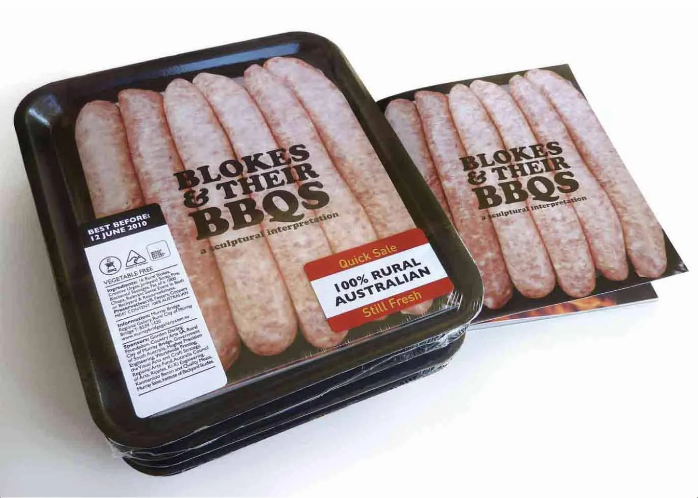
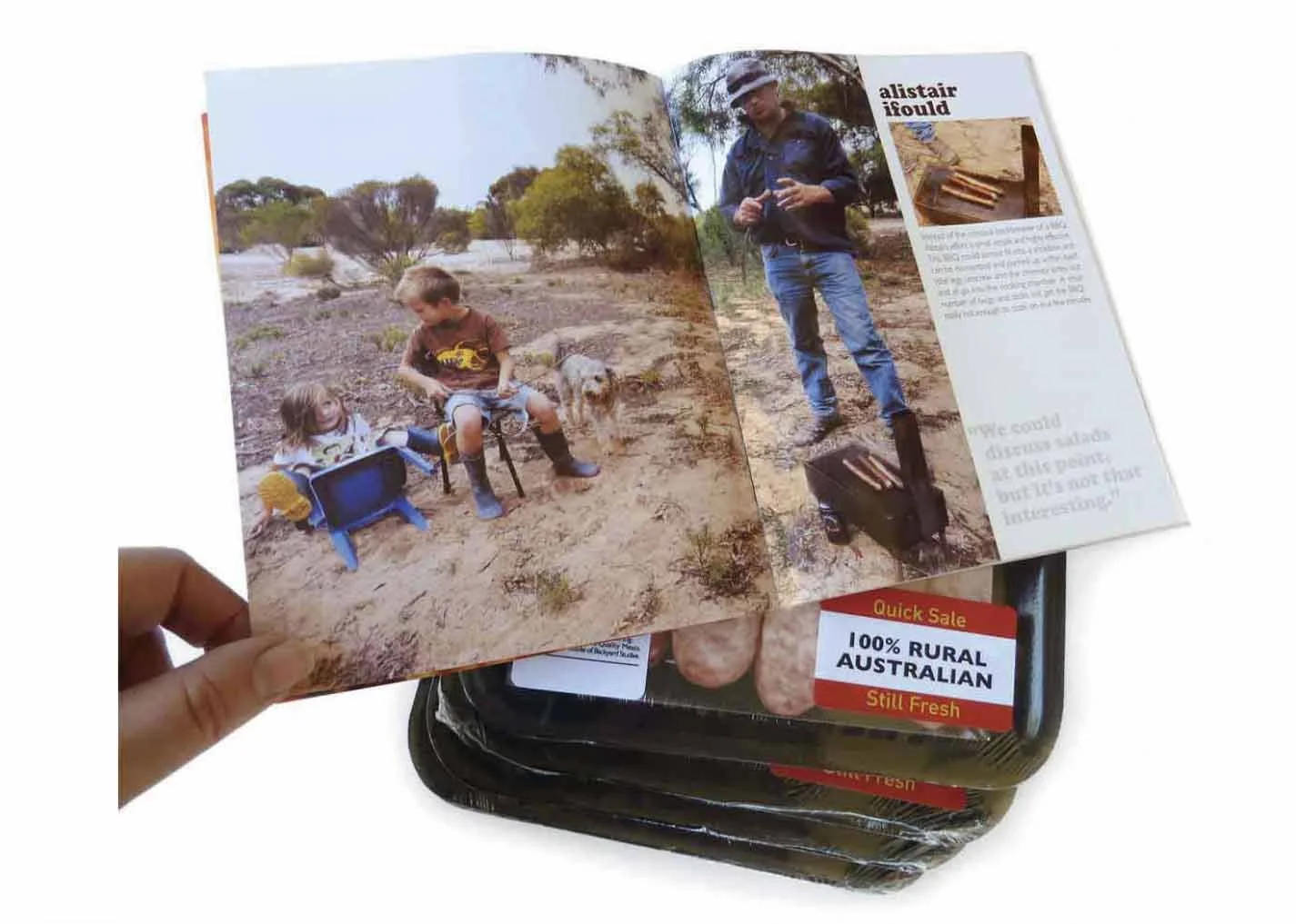
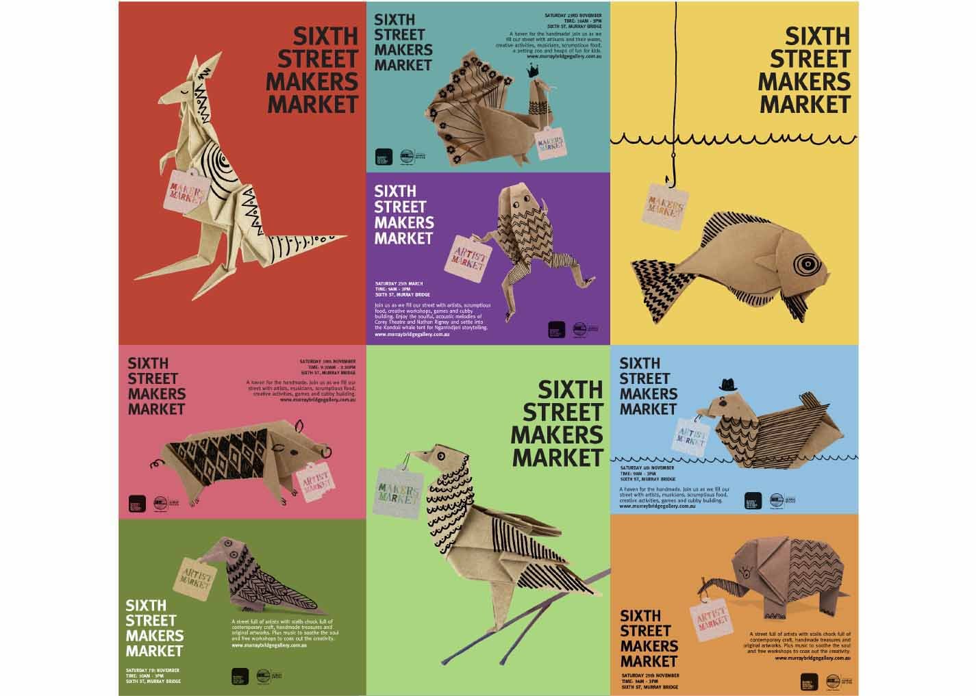
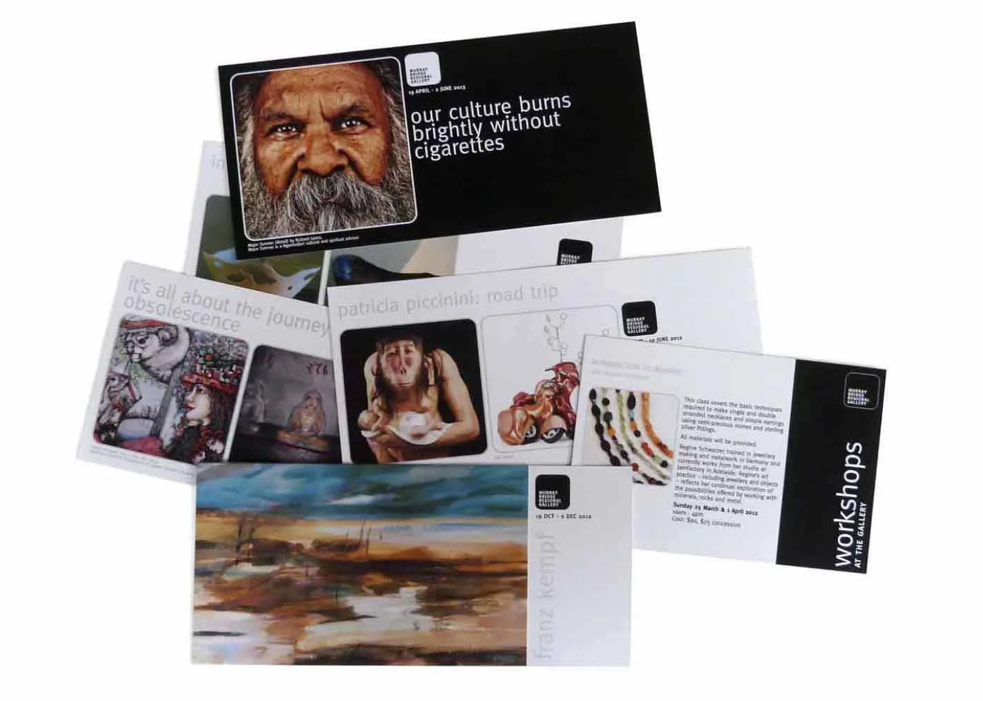
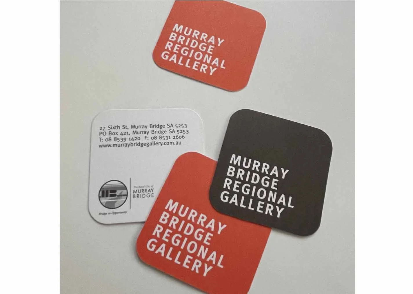
Murray Bridge Regional Gallery
The brief was to refresh the Gallery’s brand and position it as a forerunner among Australian regional galleries. The solution was a clean, simple and flexible identity designed to work across a wide range of applications while allowing the art and exhibitions to take centre stage.
While the core brand is deliberately restrained, there’s always room for a little 3 Bags Full quirkiness. For the Blokes & Their BBQs exhibition, the catalogue was presented in a meat tray - a playful way to extend the exhibition’s theme into the design.
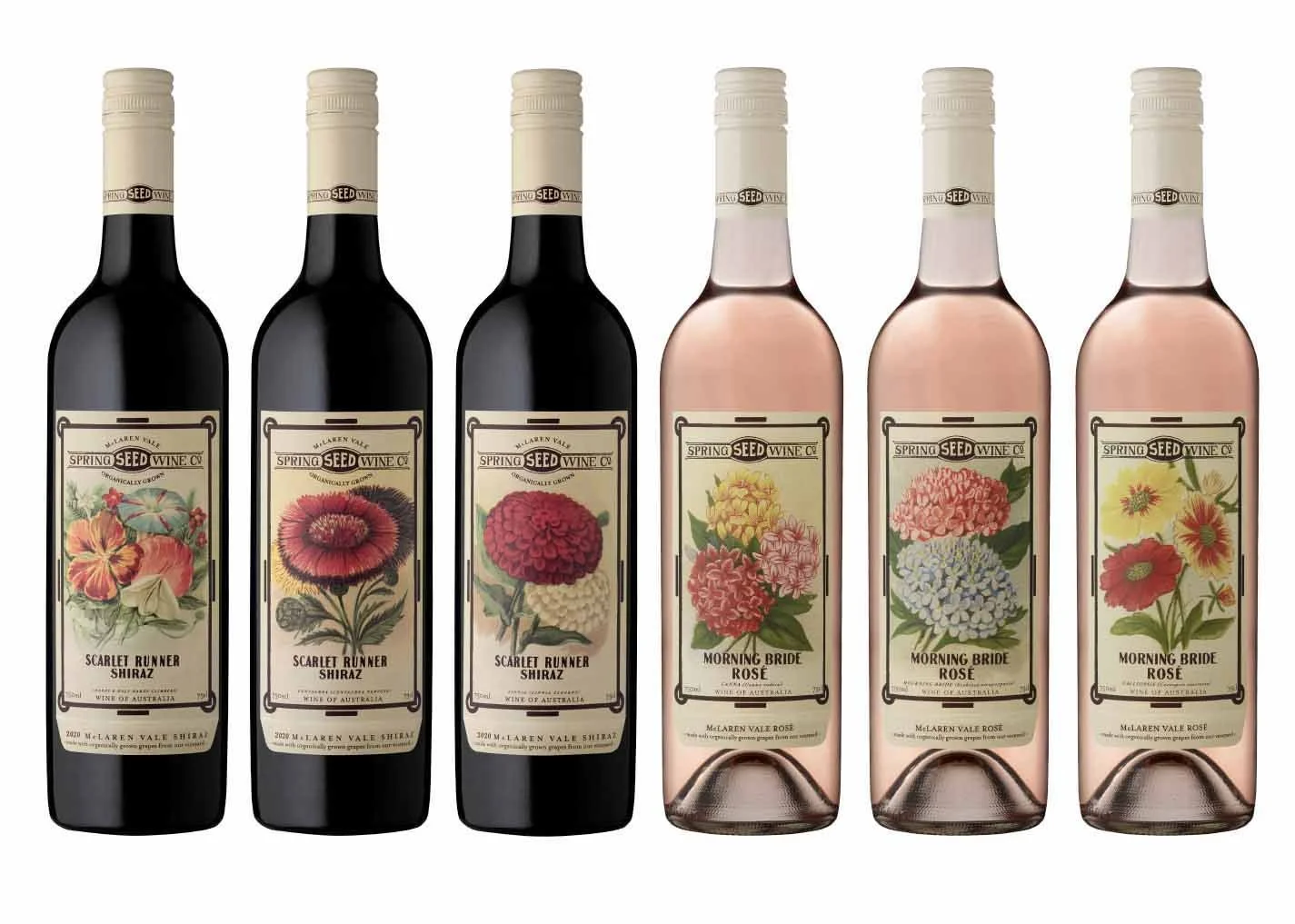
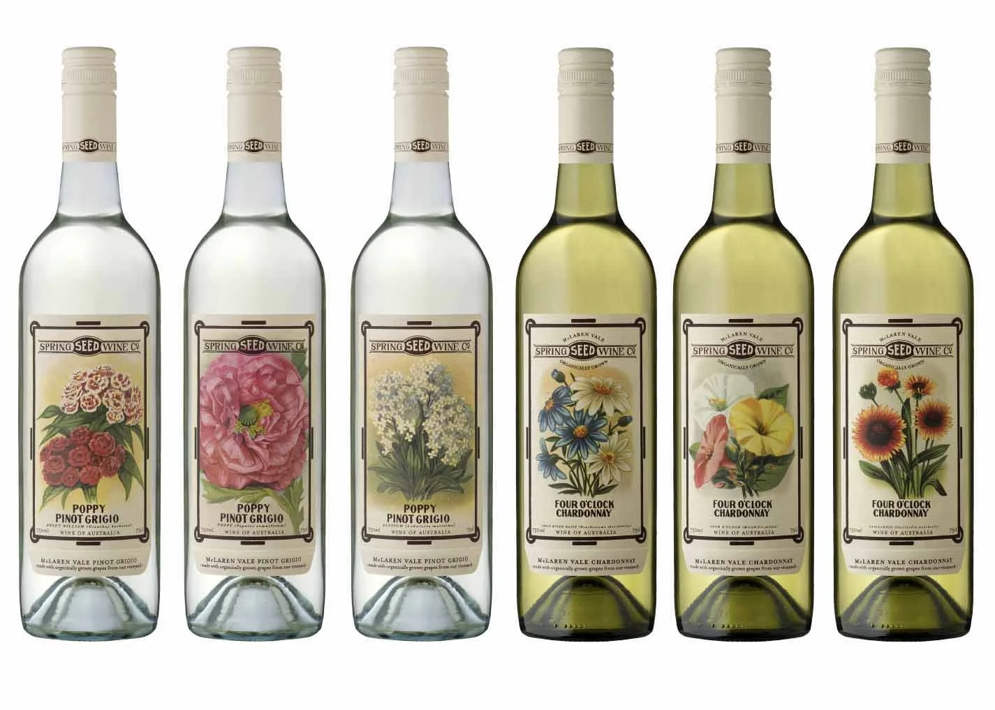
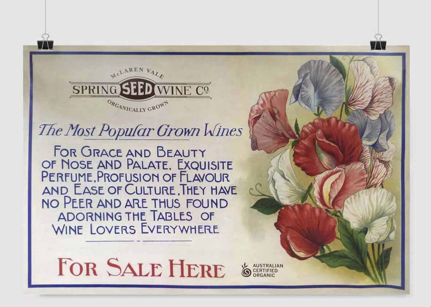
Spring Seed Wine Co.
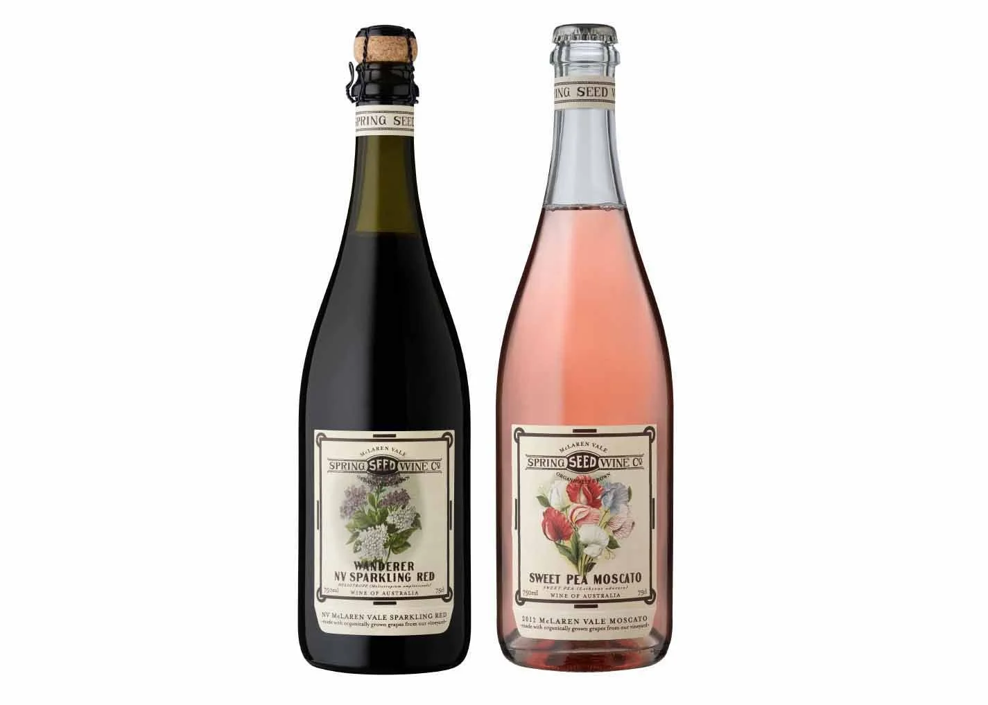
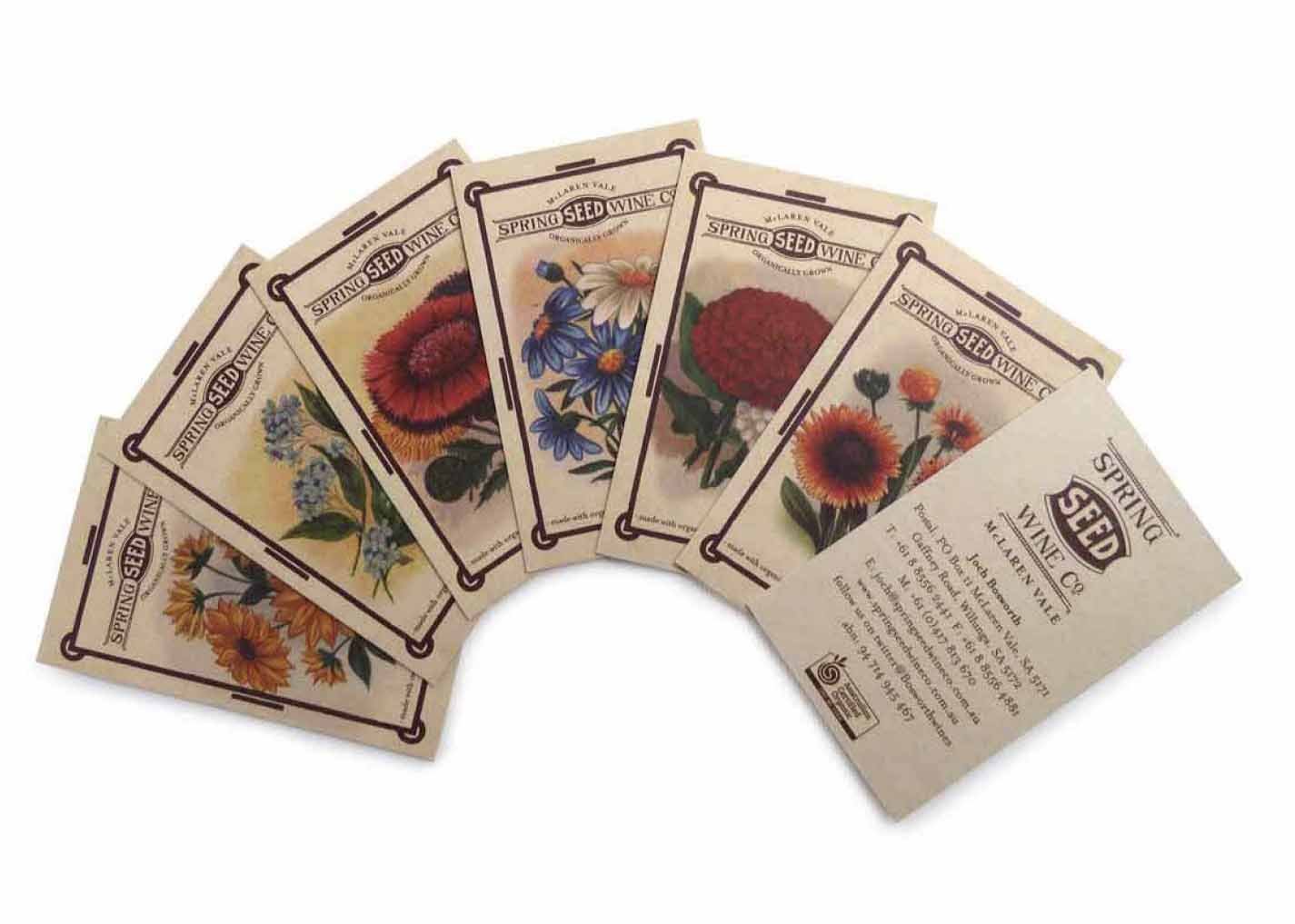
This company is fresh and fun, like the wine. Organic vineyards and traditional winemaking methods needed to be eminent in their earthy labels. The Soursob flower is paramount in their organic practises so the use of seed packet flowers was a natural solution. 3 flower labels per variety gives the wine surprise and a talking point.
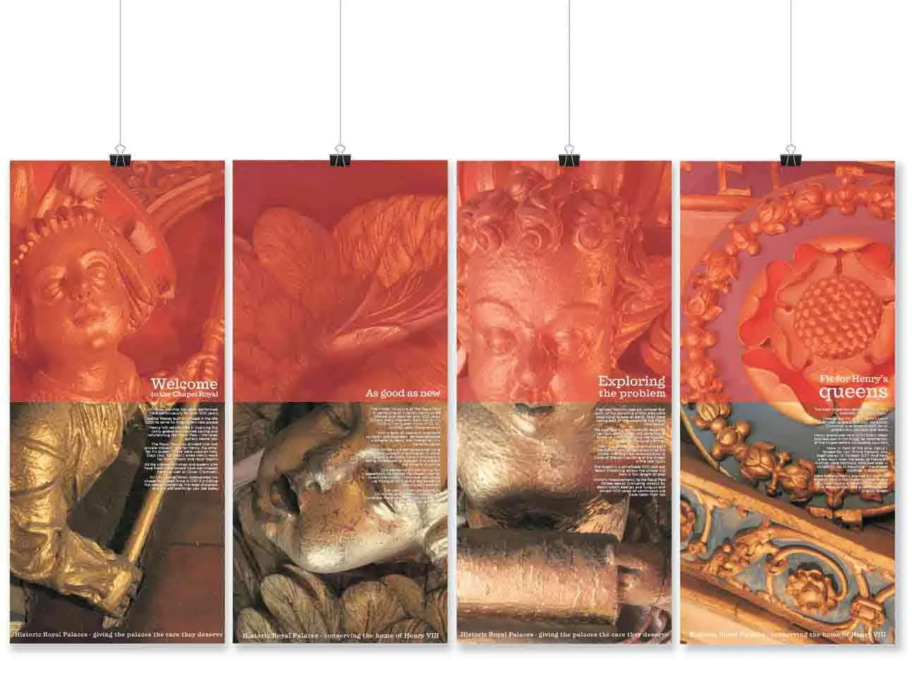
Historic Royal Palaces
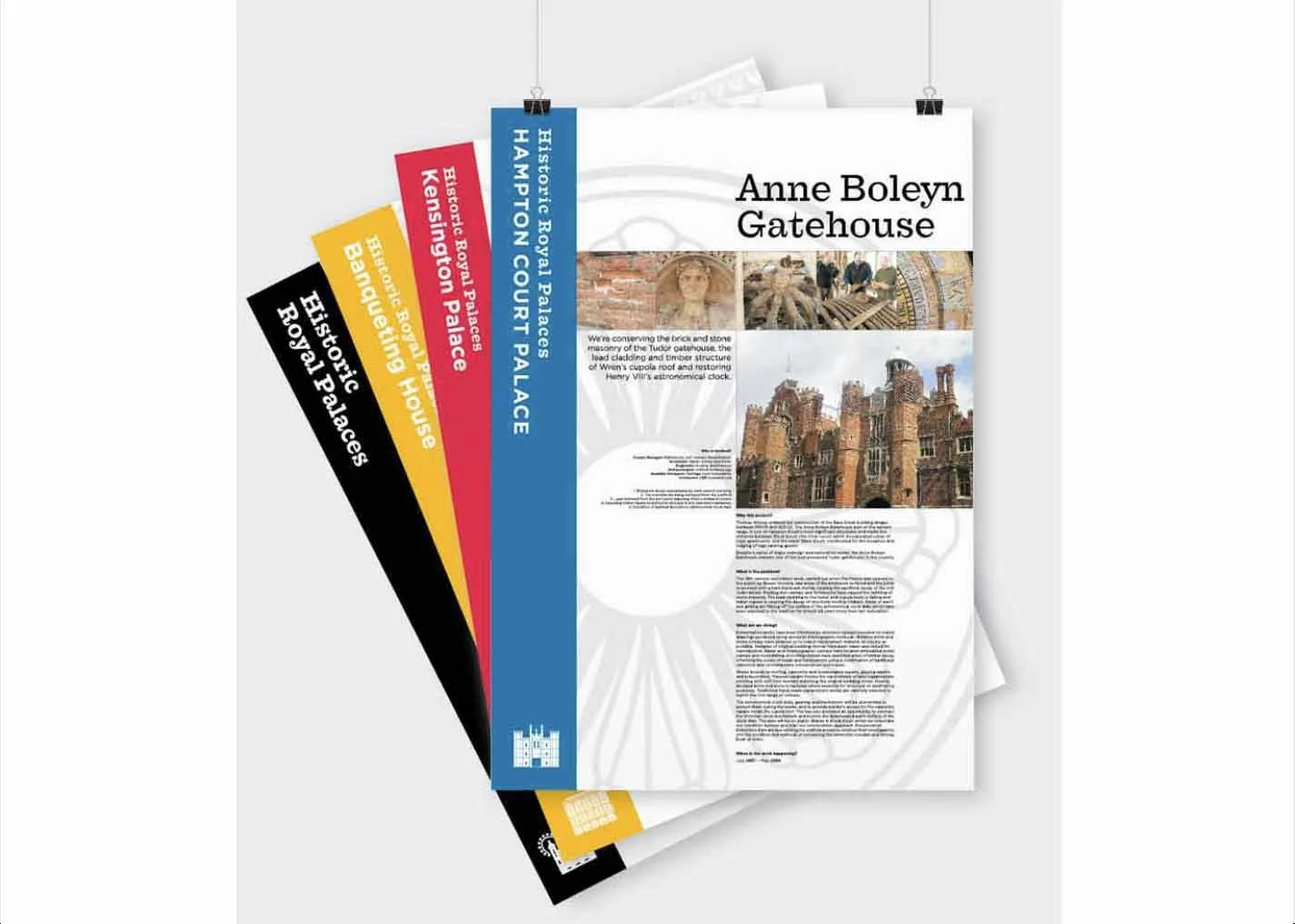
Five palaces, centuries of history and an ongoing job of bringing the past into the future. A series of large format boards and banners tell the stories behind major restoration projects, taking visitors behind the scenes to uncover what had been found, restored and revealed.
the Rose and Radish
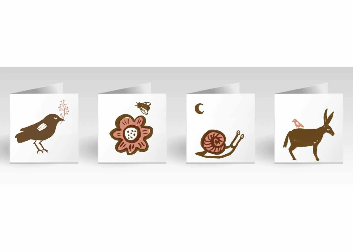
Adelaide Hills market gardener and florist Rosie creates wild, natural floral designs that feel like gathering a perfect bundle of flowers while wandering through a meadow. The brand reflects this organic spirit through flowing ink marks and soft, ethereal colours, creating a sense of beauty, movement and wildness.
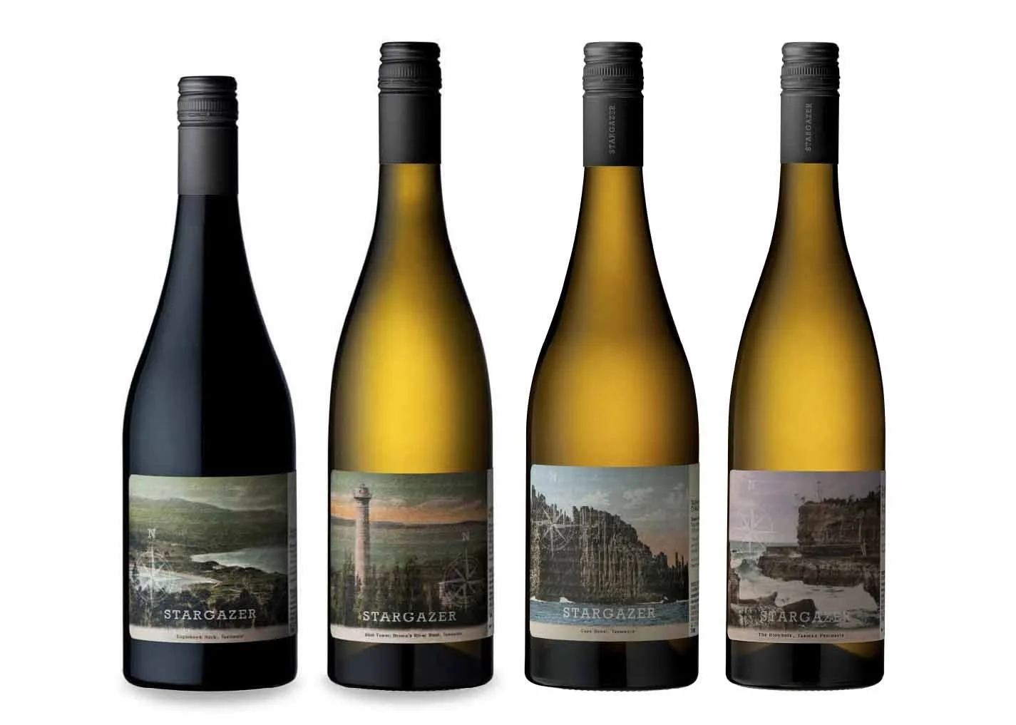
Stargazer Wines
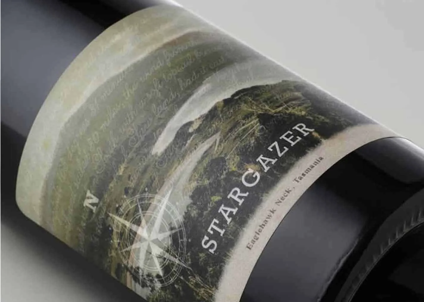
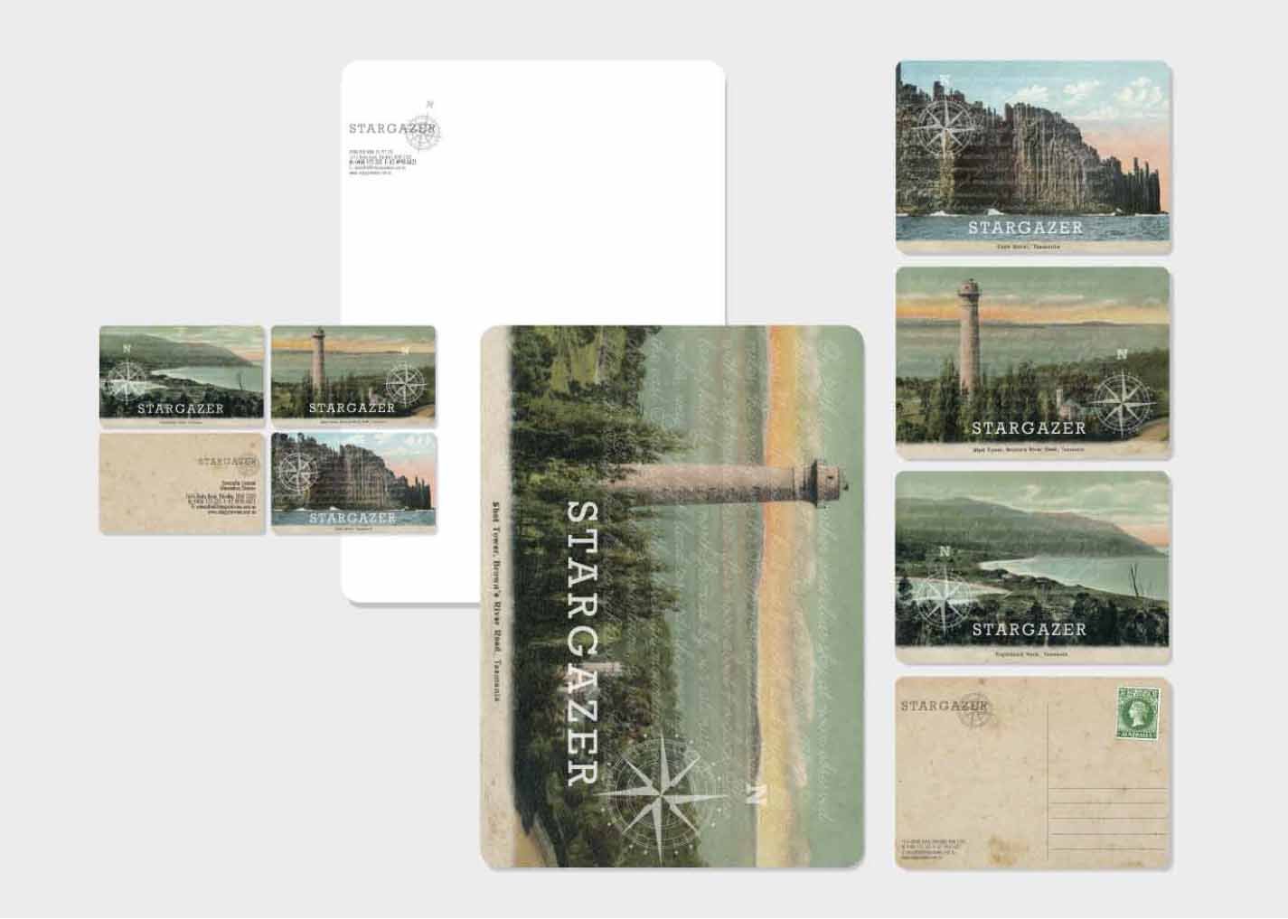
For Stargazer Wines, I developed a label series that connects the brand’s story of exploration with Tasmania’s rich history and sense of place. Inspired by Abel Tasman and the idea of looking beyond the obvious, I delved into the Tasmanian Library archives and discovered a collection of historic postcards depicting significant Tasmanian sites.
These archival images became the starting point for the label designs, pairing nostalgic, collected imagery with a contemporary wine identity. The result is a series that celebrates Tasmania’s landscapes, history and stories, while giving each wine its own distinctive sense of place.
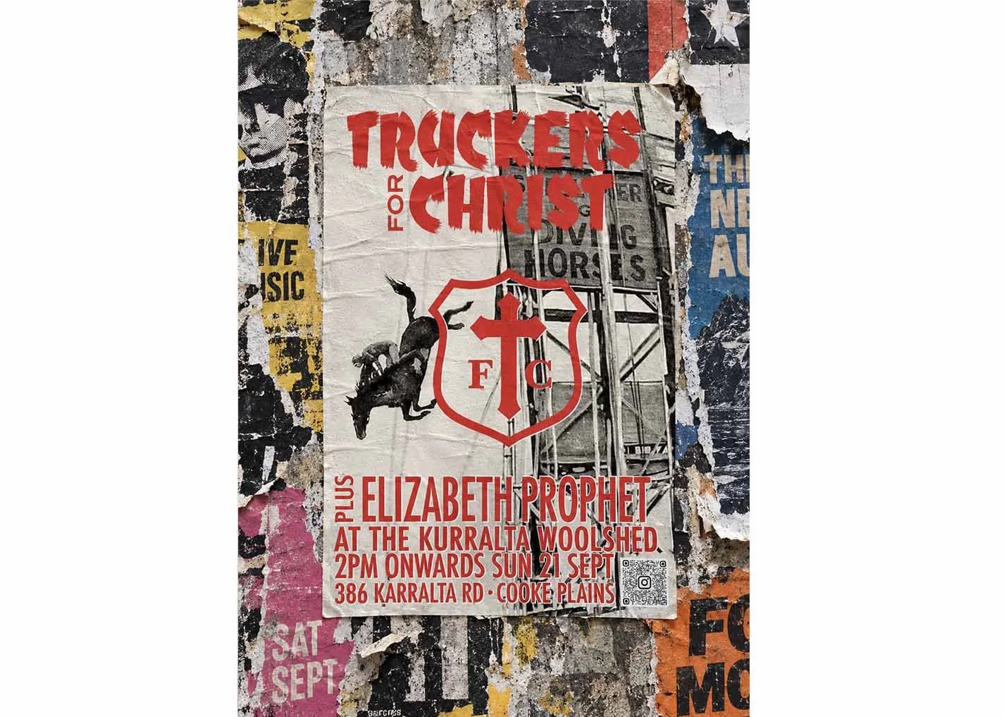
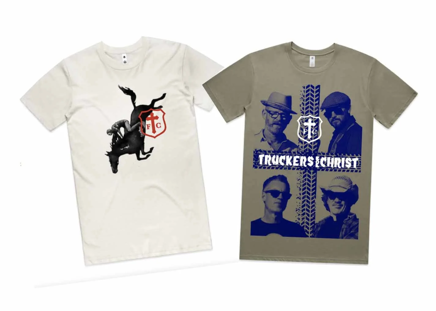
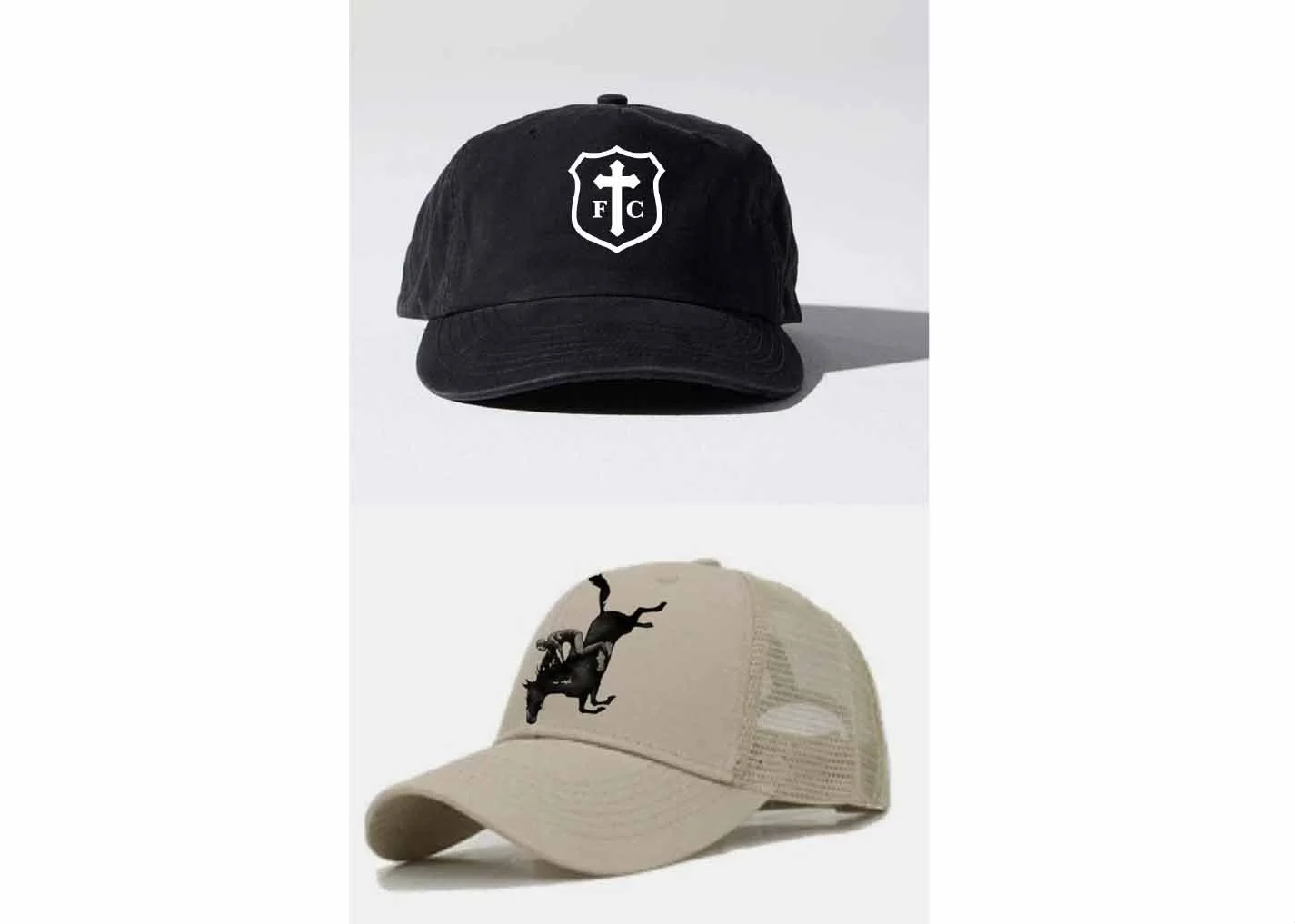
Truckers for Christ
Good times. Truckabilly. Hallelujah. A tongue-in-cheek identity, poster and merch range for Truckers for Christ - a band preaching the gospel of good times, big rigs and truckabilly. From posters to merchandise, the designs give the band their own brand of roadside religion.
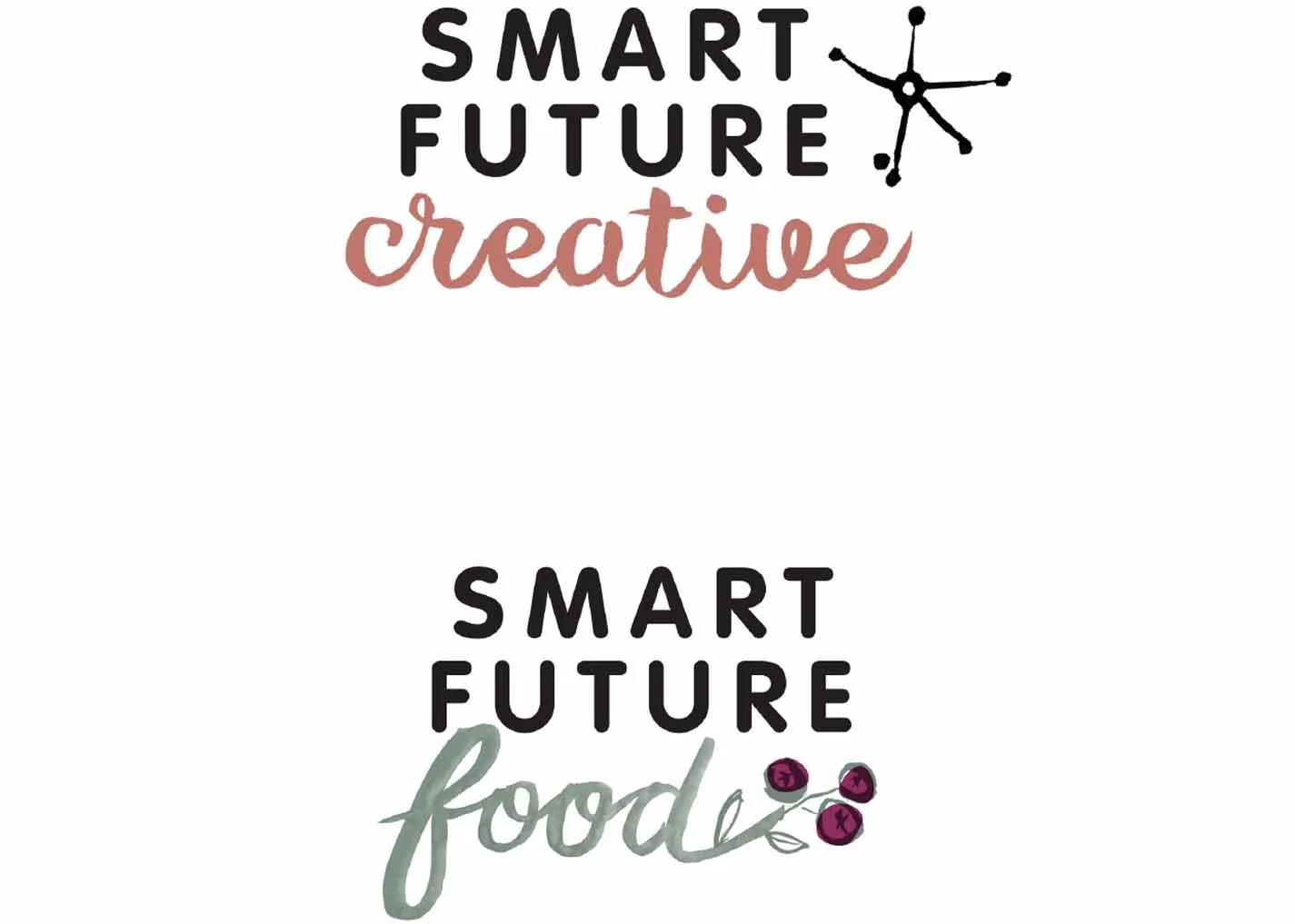
Smart Future Creative
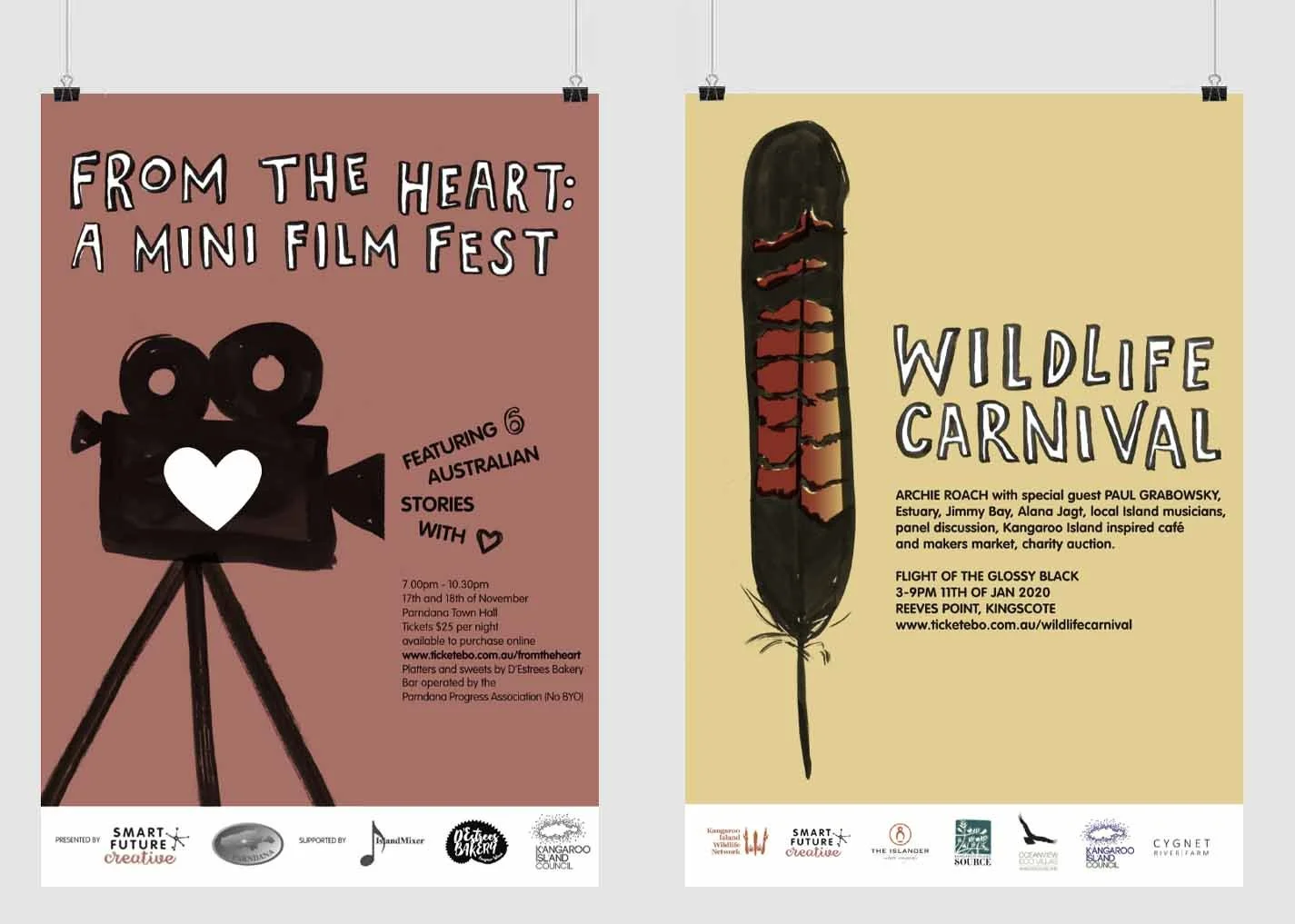
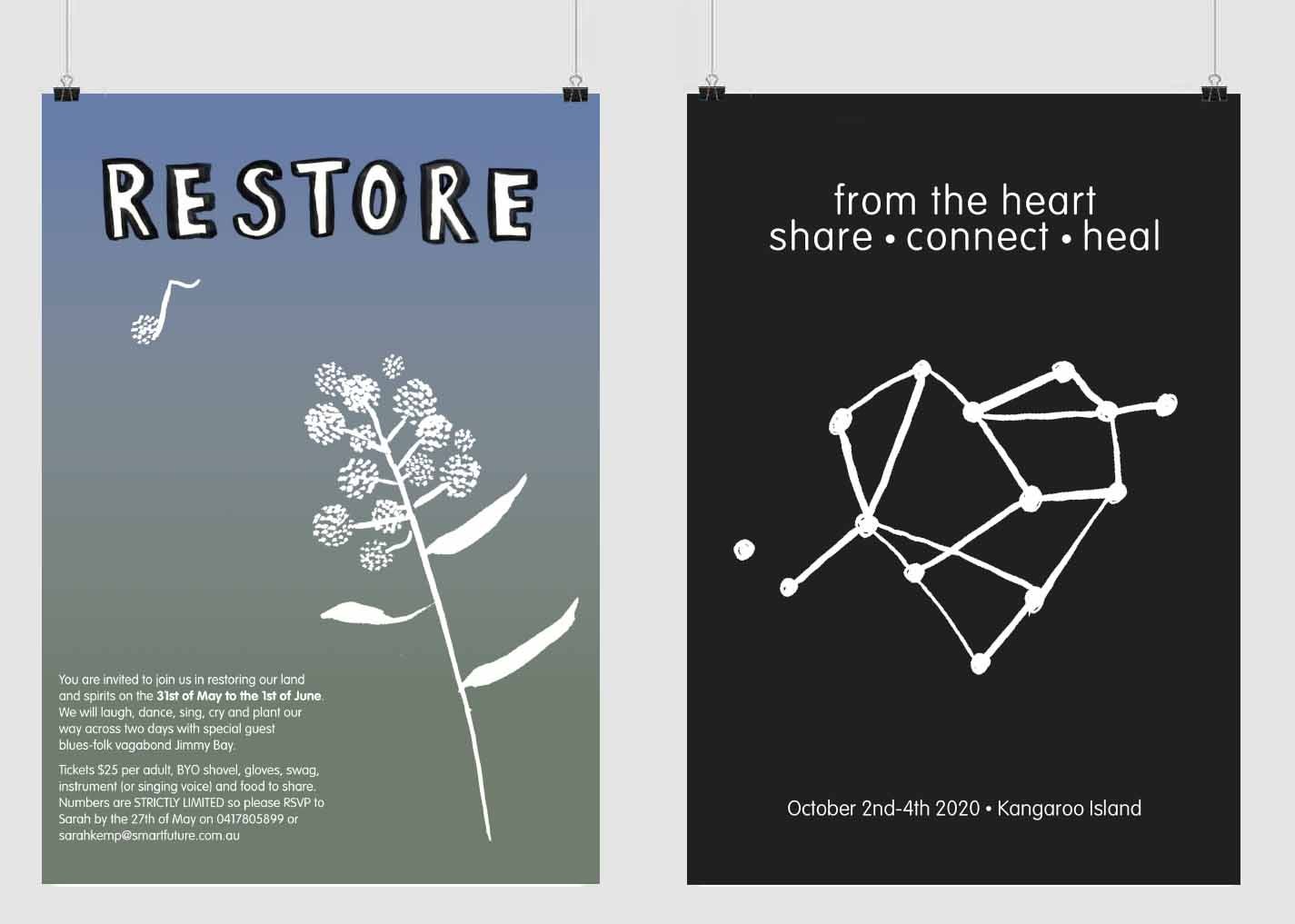
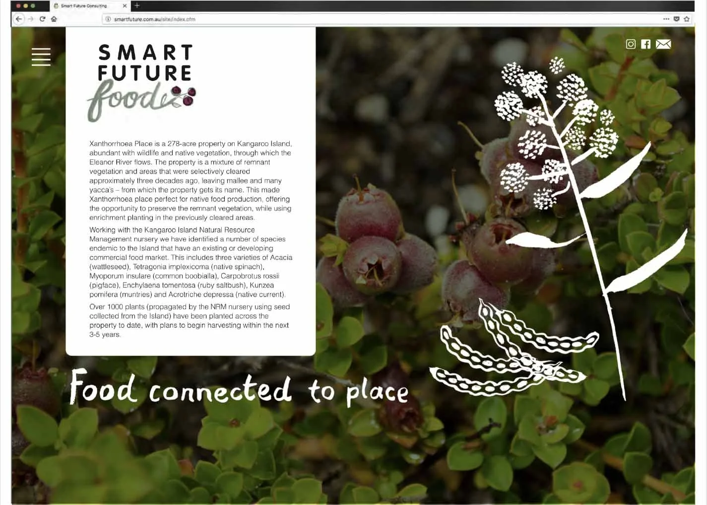
Based on Kangaroo Island, Smart Future Creative helps people reconnect with themselves, family, community and the natural world through creative expression and experiences. The brand combines strong photography with loose, expressive illustrations to capture the business’s connection to nature, creativity and community.
Vara Vodka
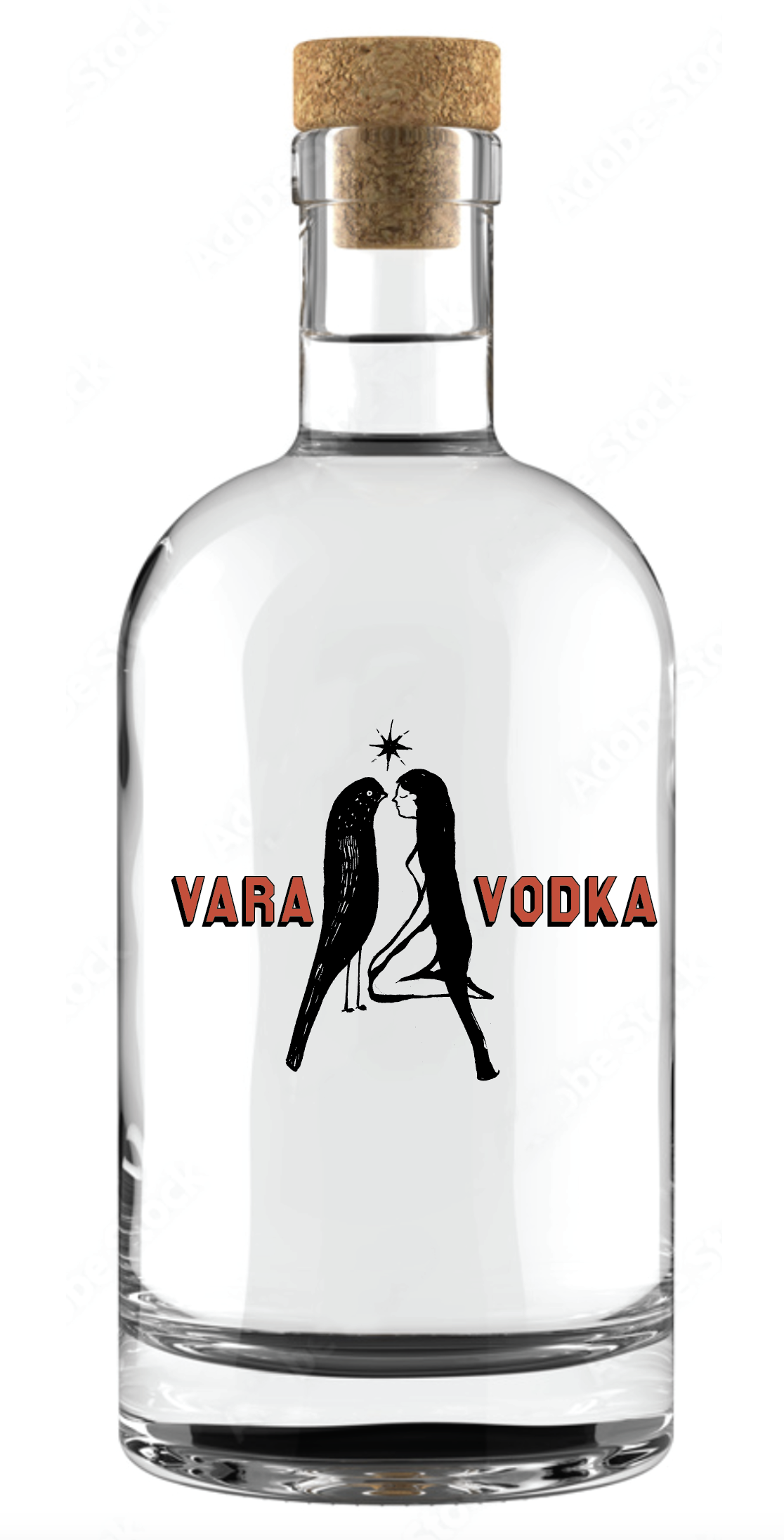
A packaging concept for Vara Vodka, developed for a Polish client looking for a fresh, youthful identity with a distinctive female presence.
I created an expressive ink illustration of a woman and a bird, deliberately drawn at the same scale to give the two equal visual weight. The pairing brought a sense of freedom, character and curiosity to the concept, creating a more unexpected take on traditional vodka packaging.
Kangaroo Island Fine Art
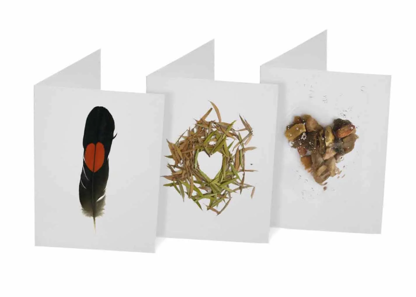
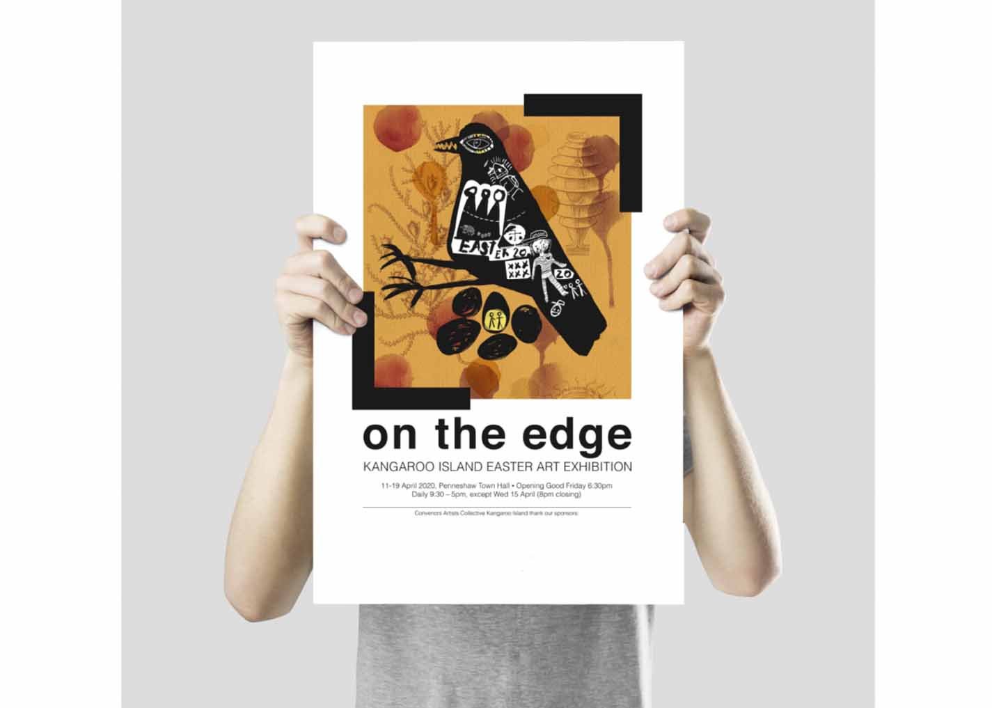
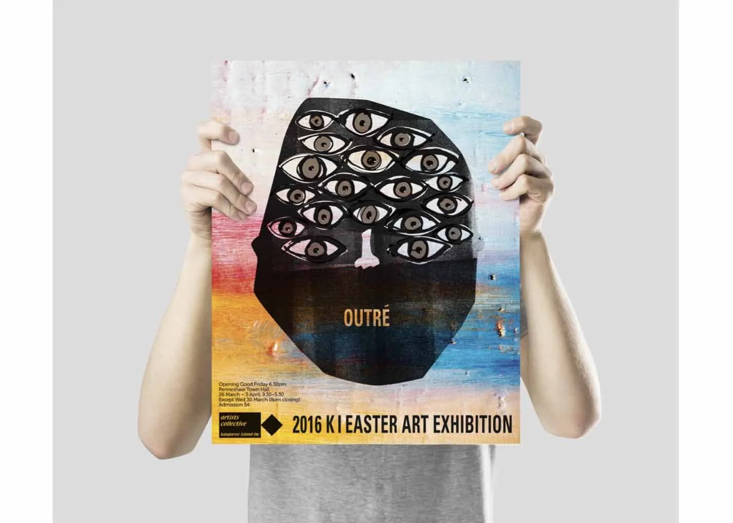
Promotional design and visual identity work for Kangaroo Island Fine Art, including annual Easter exhibition posters, promotional material and SALA exhibition branding at the National Wine Centre.
For the ‘How Do We Love Thee’ SALA series, each year focused on a different aspect of Kangaroo Island’s natural environment — from narrow-leaf eucalyptus to the glossy black cockatoo. A distinctive heart-shaped invitation was developed for each theme, creating a cohesive visual identity across the annual exhibitions while giving each year its own character.
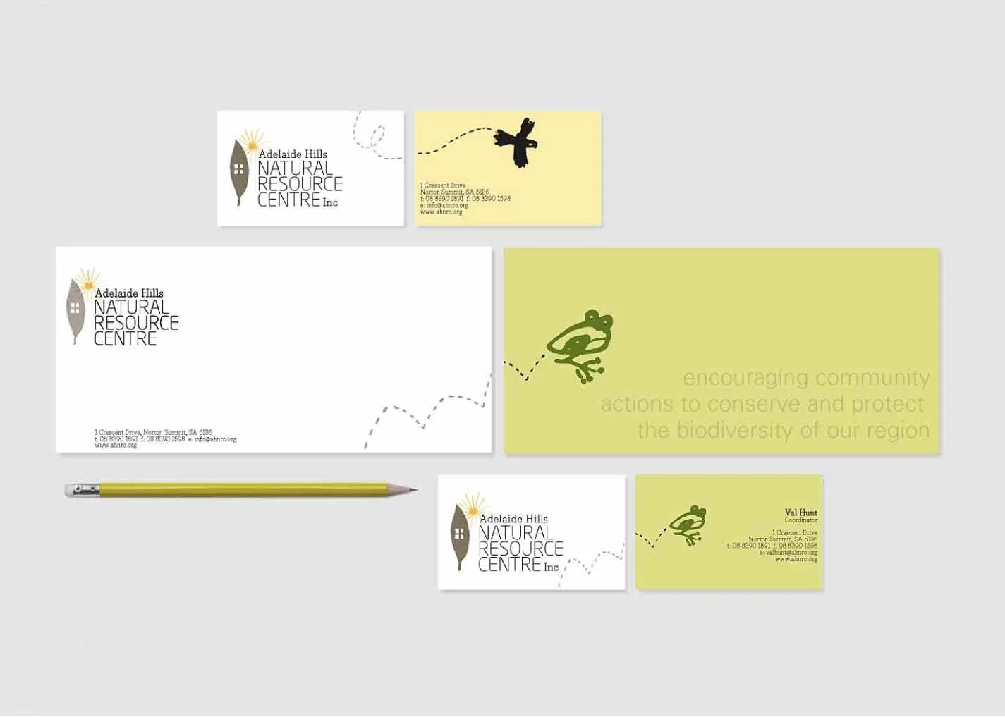
Hills Environment Centre
I developed the branding for the Adelaide Hills Natural Resource Centre, using native wildlife, vegetation and the surrounding environment as the basis for a playful visual language.
Illustrated animals gave the identity personality and humour, making environmental information and educational programs more accessible and engaging, while reinforcing a strong connection to the community.
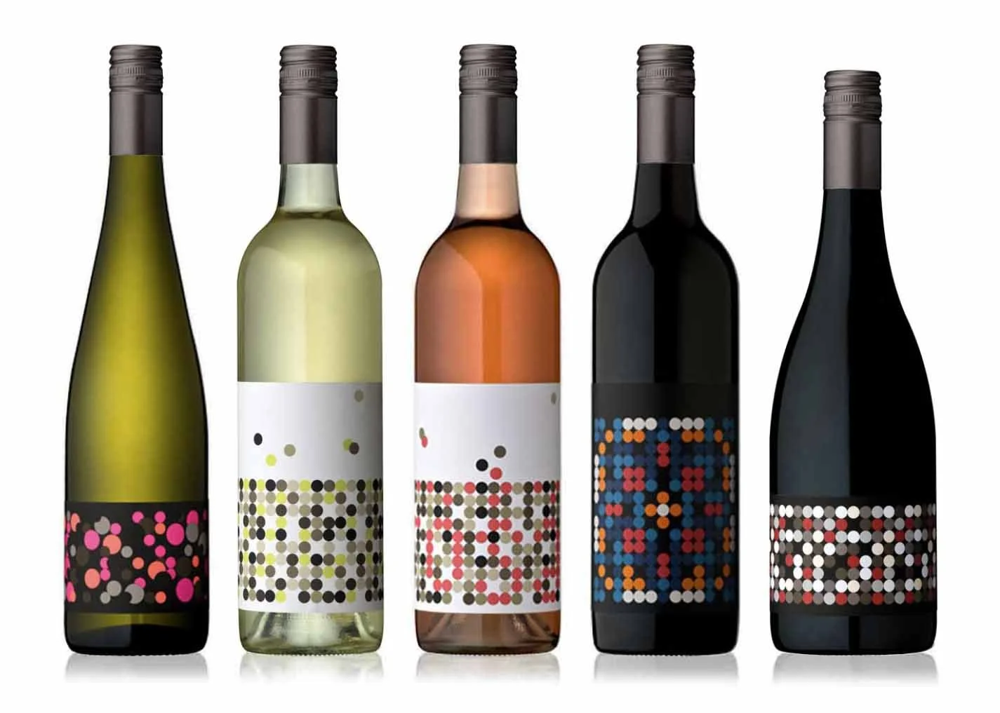
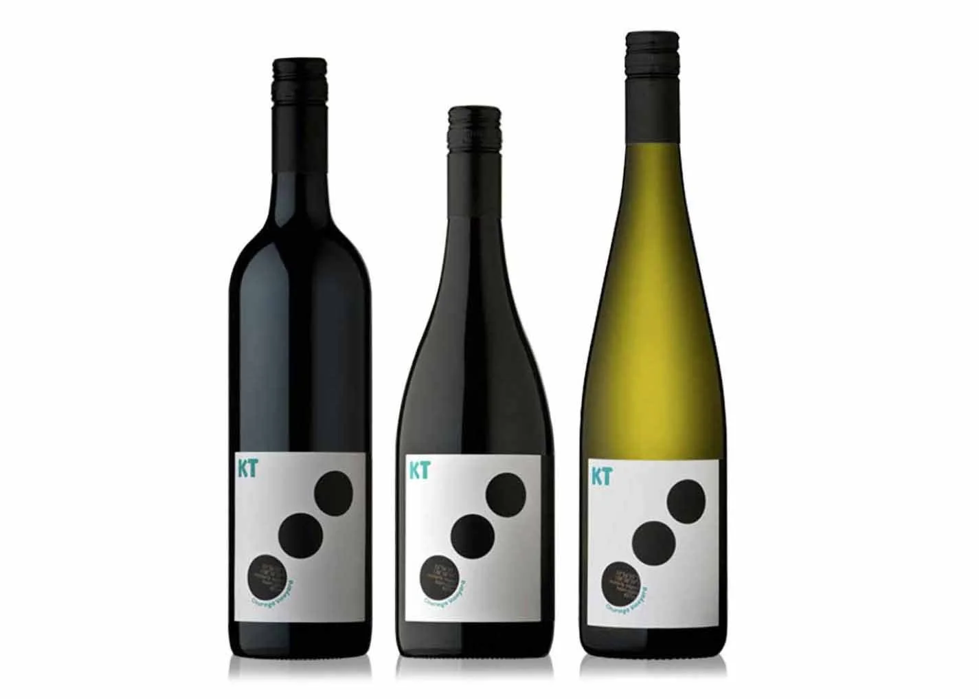
A distinctive winemaker needed a distinctive label - one that told its own story and had a visual language all of its own.
I developed a collection of labels that reflect the many facets of KT and her winemaking, with designs ranging from zesty and bold to delicate and bubbly. Each label has its own personality, while together they create a cohesive identity that feels as individual as the wines themselves.
KT Wines
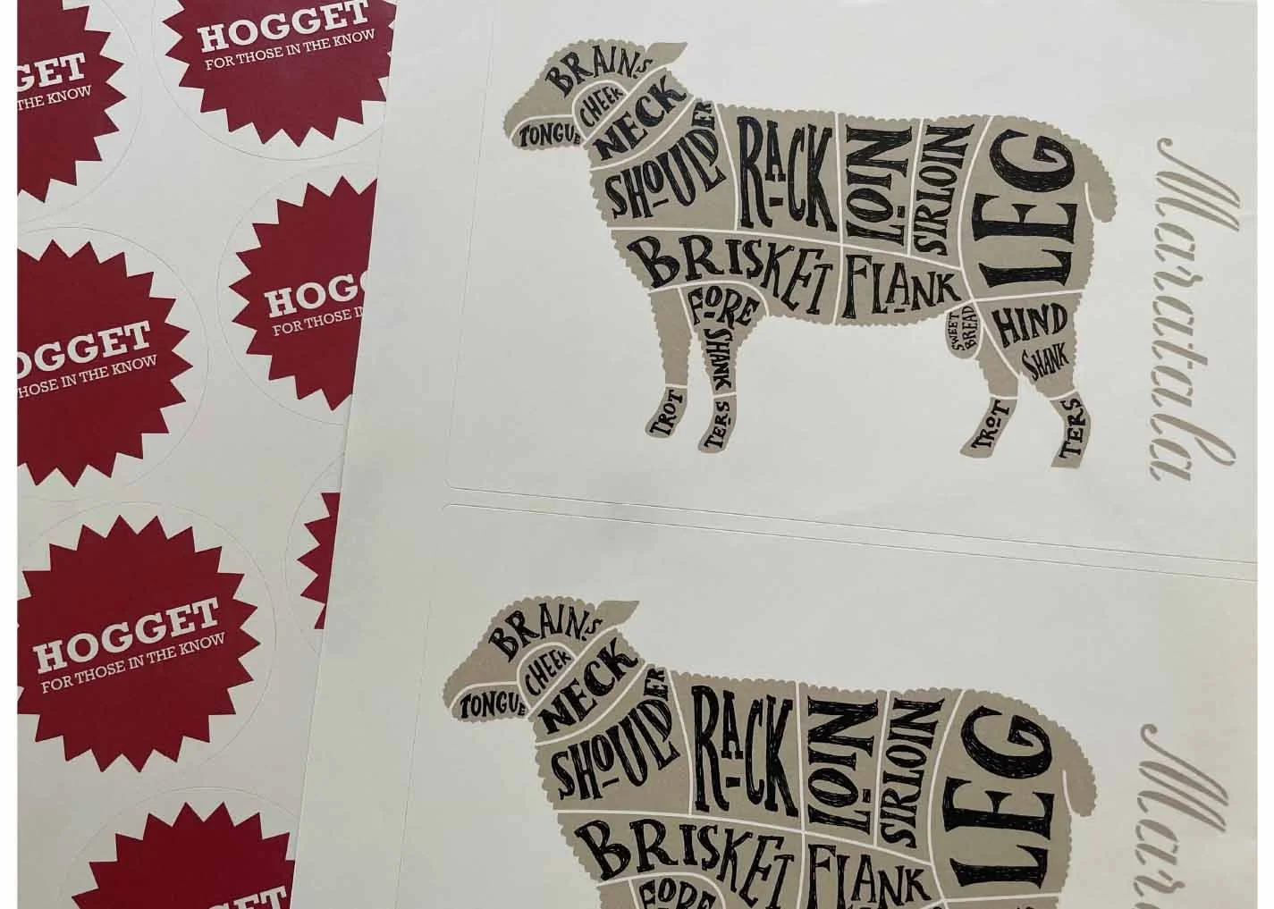
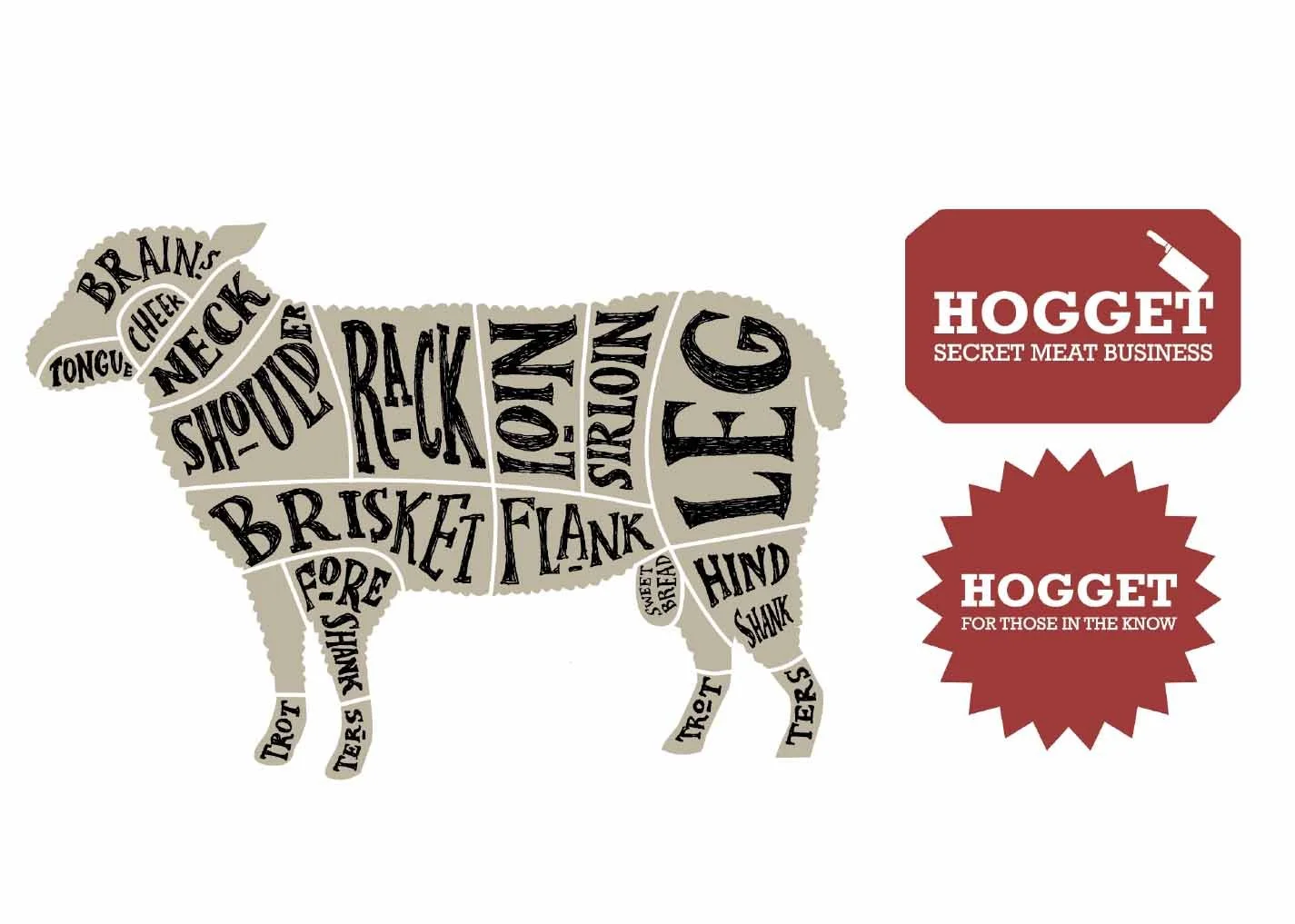
Maratala, a sheep farm in Coomandook, wanted to have a bit of fun with its meat packaging, particularly the often-overlooked hoggett.
I reworked the traditional butcher’s diagram in my own illustrative style, with each cut circled to identify what’s in the pack. From sirloin to sweetbread, every cut gets its moment in the spotlight.
Maratala
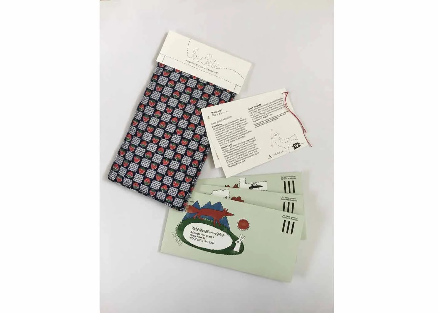
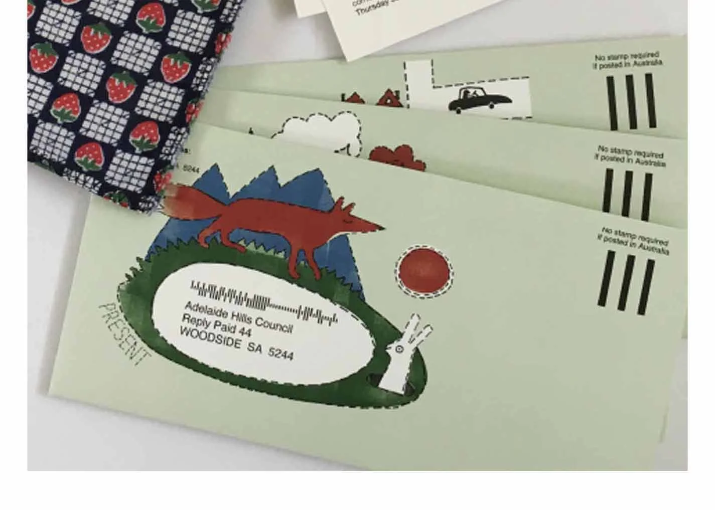
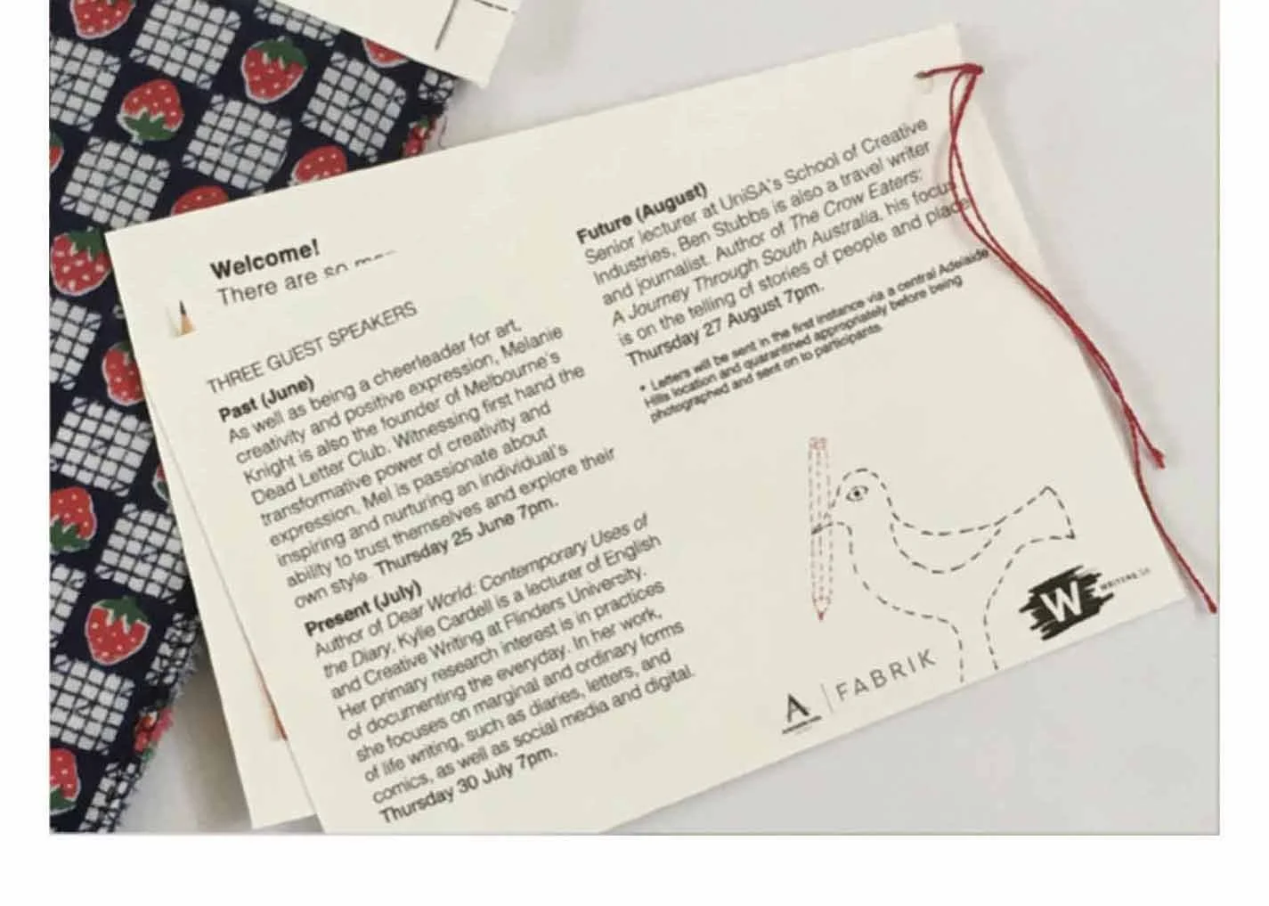
Based in Lobethal’s historic Onkaparinga blanket factory, Fabrik collaborated with Writers SA on InSite, a pandemic-era project designed to connect people across Australia through writing and old-fashioned penpals.
I developed the visual identity and illustrated a charming retro-inspired dilly bag, handmade from recycled Fabrik materials as a nod to the gallery’s creative philosophy. Inside were three illustrated aerograms and instructions, with prompts exploring the past, present and future of life during the pandemic — from isolation tales to what people were looking forward to.
The result was a tactile little package designed to encourage connection when we couldn’t be together.
Fabrik
Barossa TM
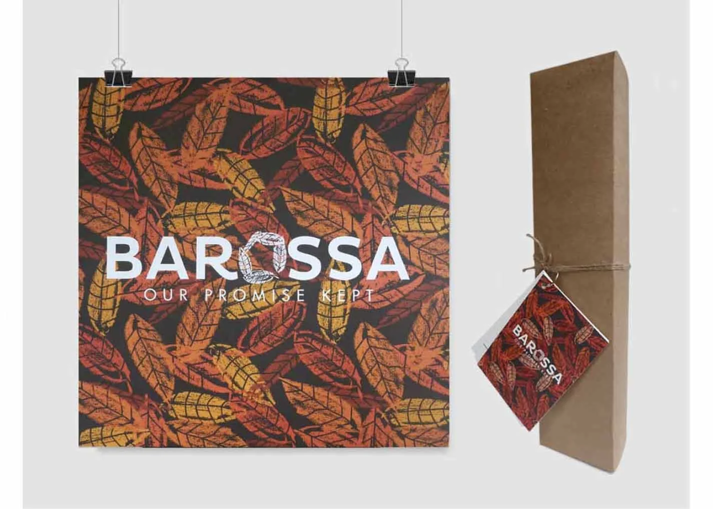
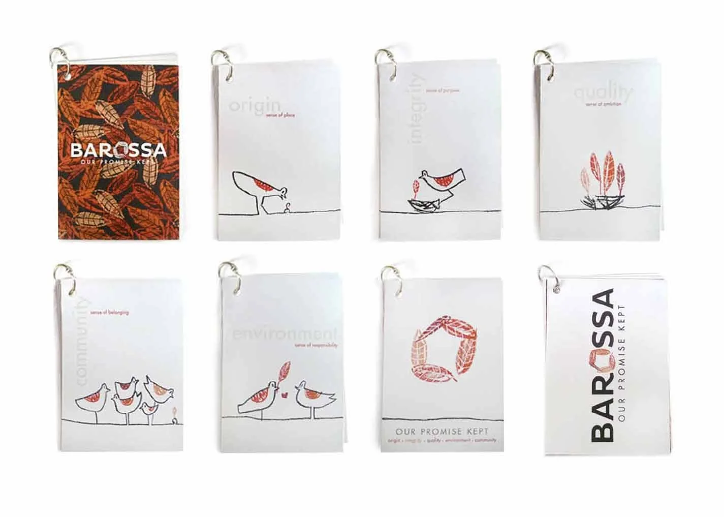
To launch Barossa TM and strengthen the region’s philosophy of origin, integrity, quality, environment and community, I developed a launch package designed to spark conversation and reinforce these shared values.
Drawing on the colours of the Barossa in autumn, I created an illustrative language of leaves and natural forms, carrying the visual concept across the launch materials. The result was a warm, distinctive identity that connected the brand values with the landscape and community they represent.
Tapestry Wines
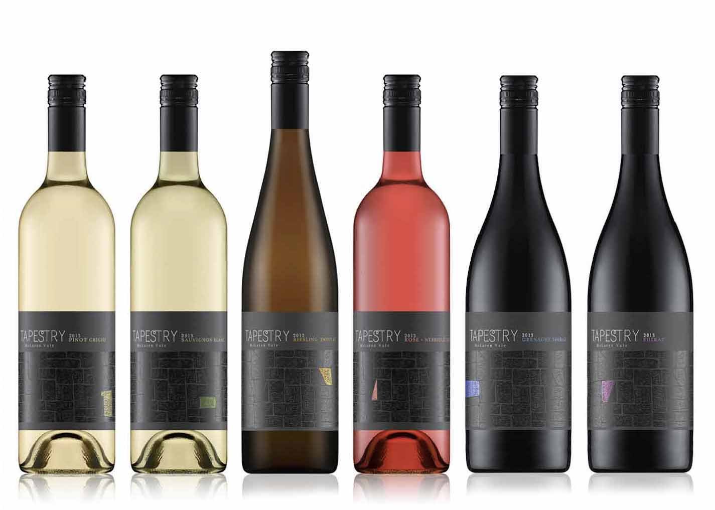
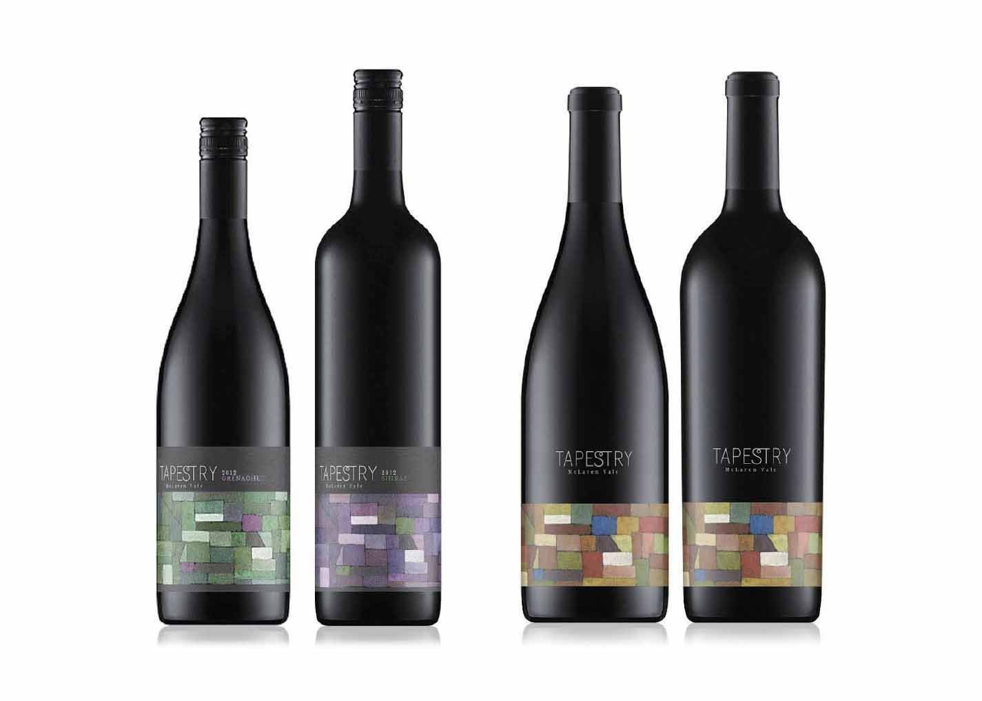
Series of labels inspired by the tapestry of vineyards that make up the wine region. Each label highlights a different vineyard, creating a visual collection that celebrates the individual character and story of each site. The result is a cohesive wine range with a strong sense of place, while giving each vineyard its own identity.
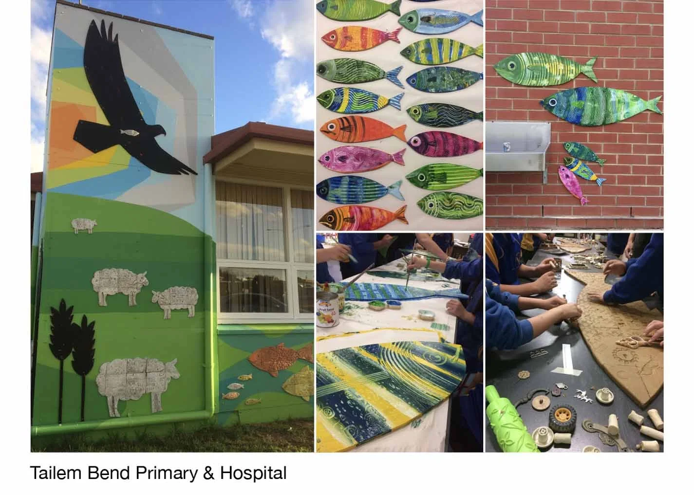
Murals
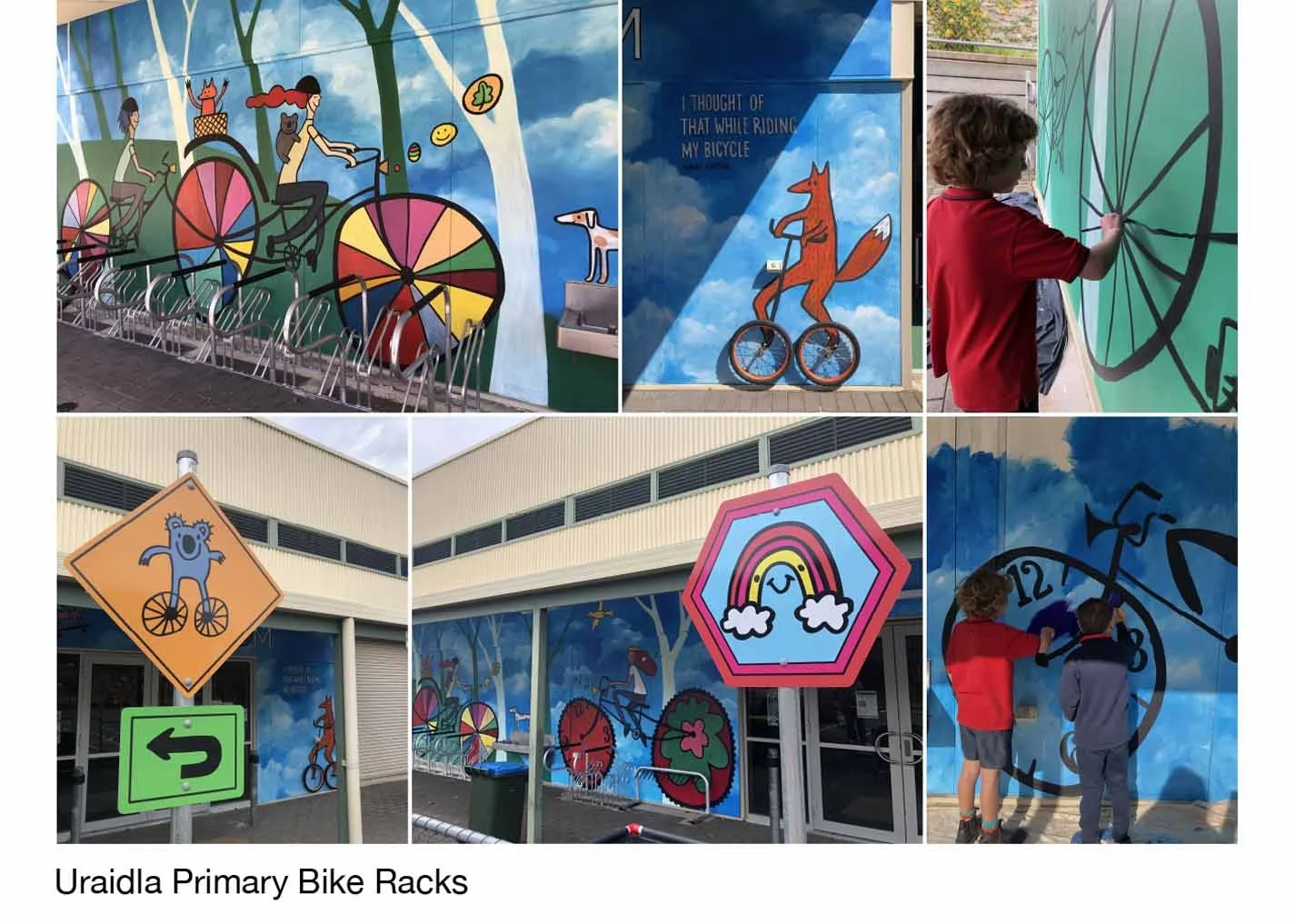
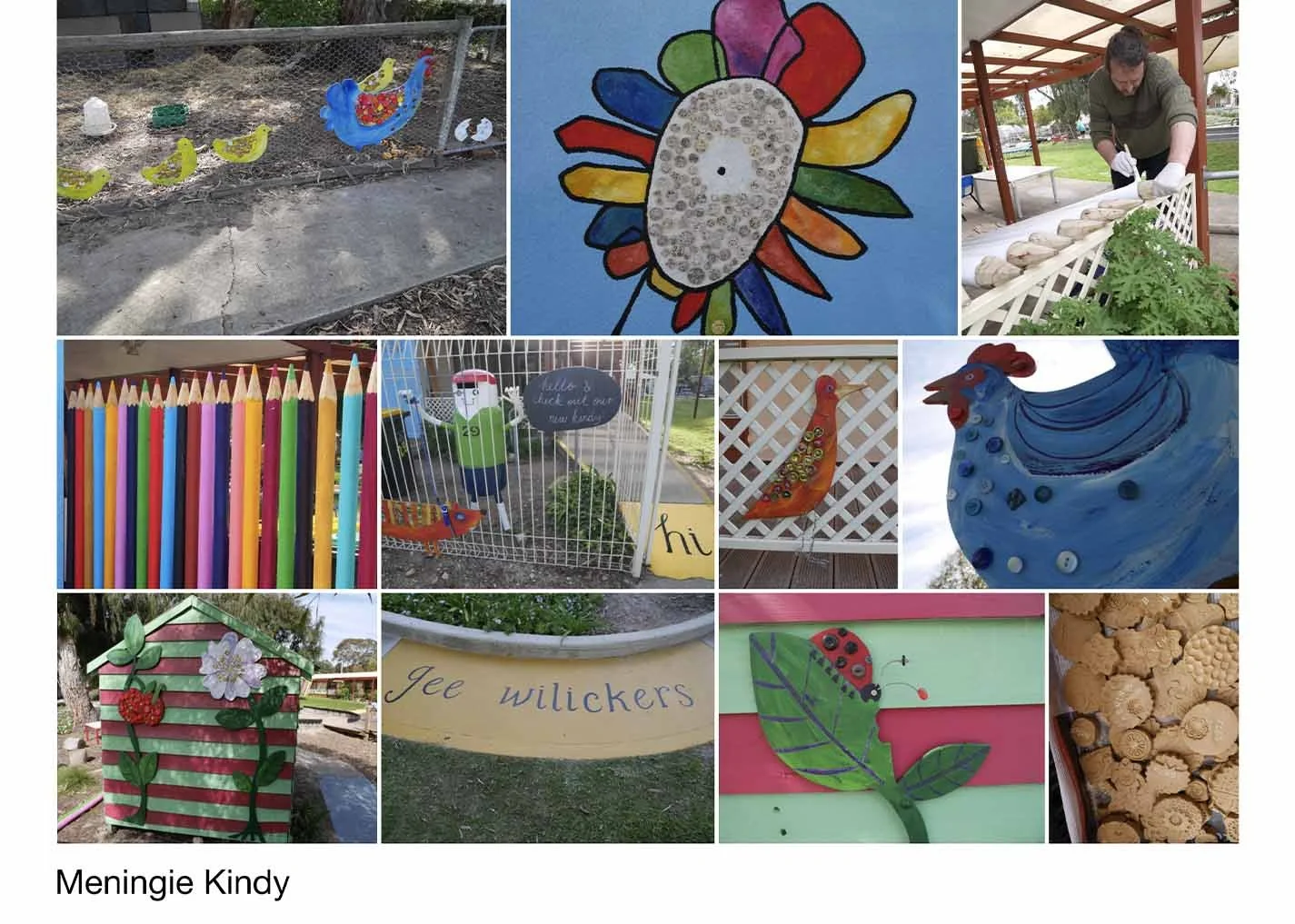
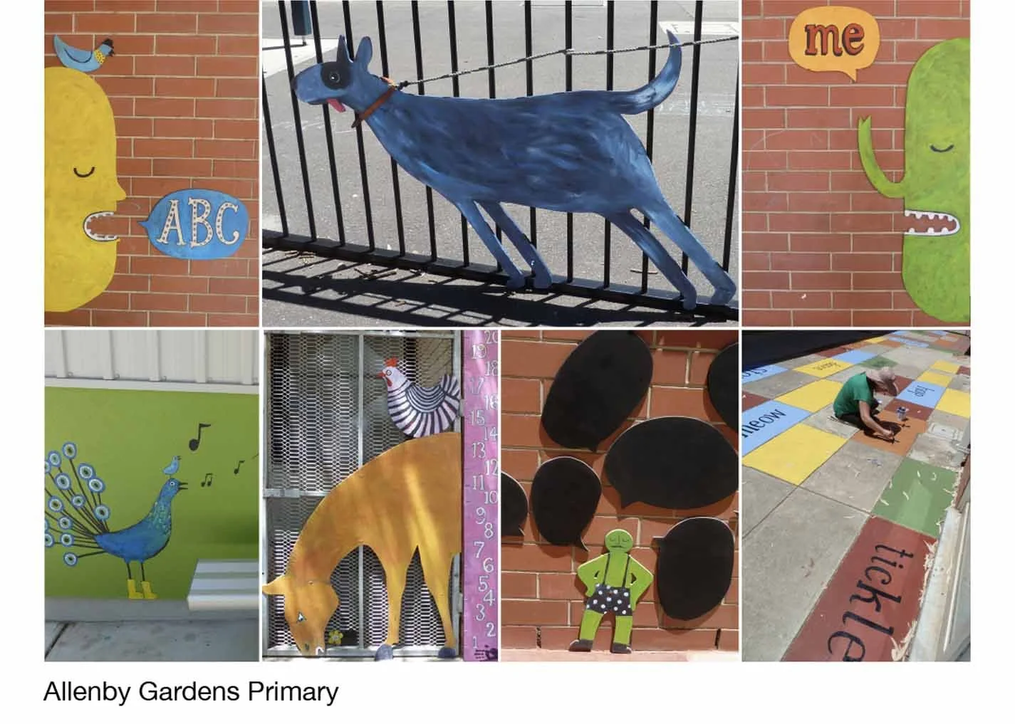
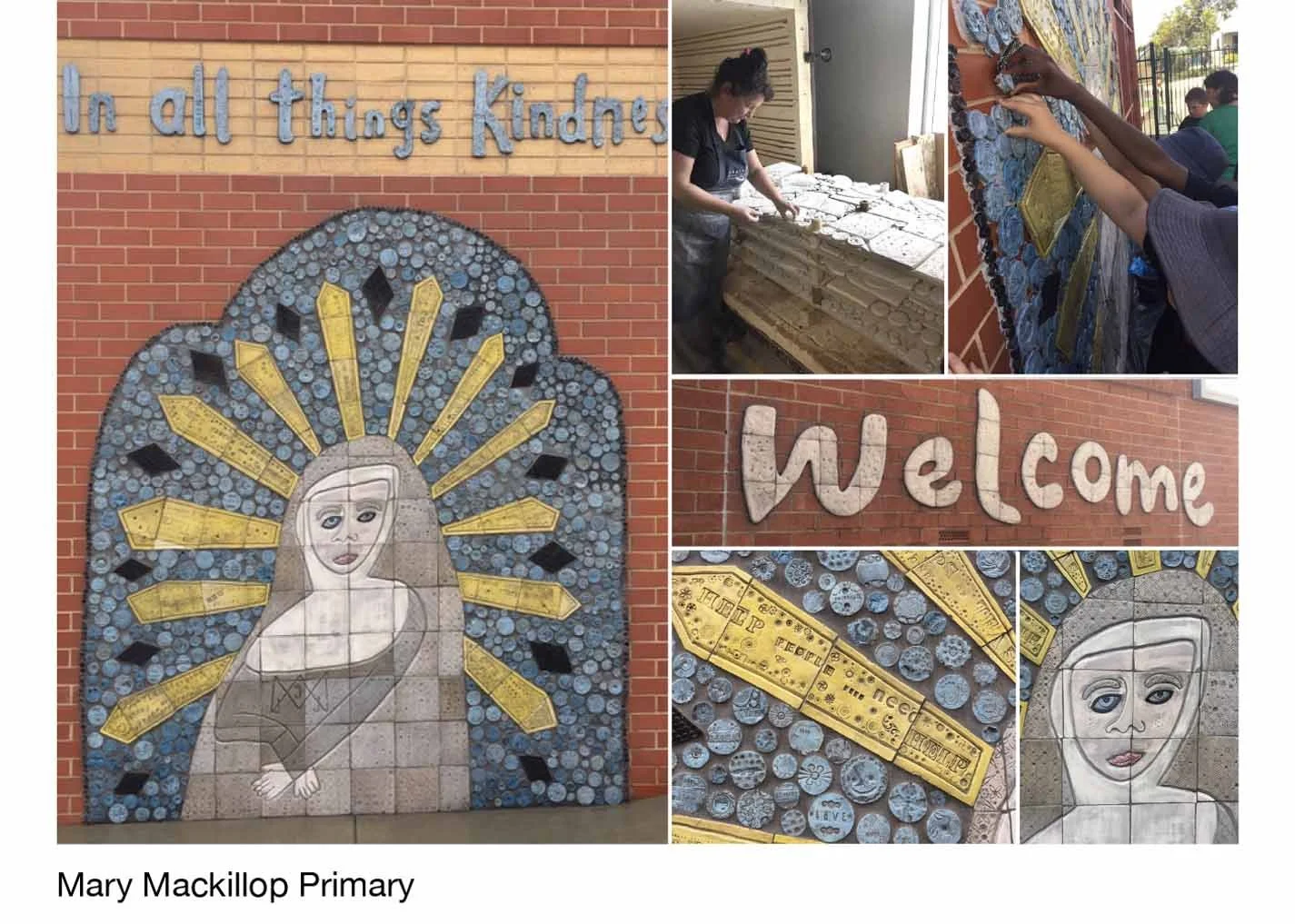
We love collaborating with primary school students to bring their ideas to life - from the initial concepts and design through to the finished mural. Some projects are painted murals, while others incorporate handmade clay tiles created by the students, often in collaboration with the wonderfully talented Suse Ifould. Each mural is a unique reflection of the students, their school and their community.